We Analyzed 2500 Bestselling Covers — Here's What Works
Data-driven analysis of 2,500+ bestselling book covers across 27 genres. Typography patterns, color palettes, image types, and what top sellers have in common.
What 2,500+ Bestsellers Reveal About Cover Design
A sample from our 2,500+-book dataset


Every author agonizes over their book cover. Should the title be bigger? Is that font too playful for a thriller? Should the background be darker? These decisions feel subjective — a matter of taste and gut instinct. But what if they're not?
We built a dataset of 2,500+ books from Amazon bestseller lists spanning 27 genre categories. We tracked everything: typography choices (serif vs. sans-serif, weight, positioning), dominant color palettes, image types (photography vs. illustration vs. AI-generated vs. typography-only), title positioning, author name prominence, and visual complexity. Then we cross-referenced these design attributes with sales performance indicators — Best Seller Rank (BSR), estimated daily sales, estimated monthly revenue, and reader ratings.
The results aren't what most authors expect. Cover design isn't random. There are clear, measurable patterns that separate top-performing covers from the rest. Some of these patterns are genre-specific. Others are universal. All of them are actionable.
This article presents the findings. No opinions — just data. Every claim is backed by the numbers from our dataset. If you're designing a cover (or hiring someone to design one), these patterns will help you make decisions based on evidence, not guesswork.
Typography: Serif vs. Sans-Serif by Genre
The single most decisive typographic choice on a book cover is the font category: serif or sans-serif. This isn't a minor aesthetic detail — it's a genre signal that readers process in milliseconds. Get it wrong and your cover speaks the wrong language before a reader even reads the title.
Here's what the data shows across our 27 genre categories:
Serif-dominant genres (70%+ serif title fonts):
Romance leads the pack at 84% serif titles. This includes display serifs, Didone fonts (high-contrast serifs like Bodoni and Didot), and transitional serifs. The romance reader's eye is trained to associate serif typography with the genre — a sans-serif title on a romance cover is an immediate red flag that signals "not for me." Dark romance runs slightly lower at 78%, favoring bolder, more angular serifs over the elegant Didones of contemporary romance.
Fantasy follows at 81% serif, with a strong preference for decorative and display serifs that evoke a classical, archaic, or mythic feel. The most successful fantasy covers use serifs with distinctive character — not generic Times New Roman, but fonts with personality: sharp terminals, exaggerated contrast, or medieval influences.
Historical fiction sits at 79% serif, leaning toward traditional book serifs (Garamond, Caslon, Baskerville variants) that echo the period feel of the content. Literary fiction comes in at 75% serif, though the serifs here tend to be more restrained and elegant — think Freight Display or Playfair rather than ornate display faces.
Sans-serif-dominant genres (60%+ sans-serif title fonts):
Thriller and suspense lead at 72% sans-serif. The preference is overwhelmingly for condensed, bold sans-serifs — fonts that feel urgent, modern, and slightly aggressive. Impact, Oswald, Barlow Condensed, and custom condensed gothics dominate. The key trait: vertical compression. Thriller fonts are tall and narrow, creating visual tension that matches the genre's pacing.
Science fiction runs 68% sans-serif, favoring geometric and futuristic sans-serifs. Clean lines, uniform stroke widths, and occasionally stylized letterforms (custom ligatures, angular cuts) signal modernity and technology. Space opera and hard sci-fi skew even higher toward sans-serif; literary sci-fi allows more serif mixing.
Self-help and non-fiction business titles hit 82% sans-serif, typically in bold or extra-bold weights. The message: authority, clarity, no-nonsense. These covers use type as the primary visual element, with minimal or no imagery.
Mixed genres (no strong preference):
Mystery/detective fiction splits almost evenly: 52% serif, 48% sans-serif. Cozy mysteries lean serif (script fonts are also common); police procedurals and noir lean sans-serif. The sub-genre matters more than the parent genre here.
Horror is similarly split at 55% sans-serif, 45% serif, with the caveat that horror favors distressed versions of either category — weathered, eroded, or hand-drawn letterforms that feel unsettling regardless of the font's underlying structure.
Takeaway: Before choosing a font, look at the top 20 covers in your specific sub-genre. If 80% use serifs, your cover should use a serif. Fighting genre conventions doesn't signal creativity — it signals unfamiliarity with the market. See our complete genre font guide.
Color Palettes: What Top Sellers Use by Genre
Color is the fastest visual signal on a book cover. A reader's brain processes the dominant color of a thumbnail before it reads a single word of the title. In our dataset, we extracted the three dominant colors from each cover and mapped them against genre and sales performance. The patterns are striking.
Romance: The dominant palette is warm tones — pinks, reds, warm golds, and deep burgundies. Contemporary romance skews lighter (blush pink, coral, champagne), while dark romance goes deep (burgundy, black, blood red). The critical finding: romance covers with cool-dominant palettes (blue, teal, grey) underperform warm-palette covers by an average of 34% in estimated monthly revenue. The top 50 romance covers in our dataset all use warm tones as the primary or secondary color.
Thriller: Dark palettes dominate — black, dark navy, charcoal — with a single high-contrast accent color. Red is the most common accent (42% of thriller covers), followed by yellow/gold (23%) and white (19%). The pattern is "darkness plus one pop of intensity." Thrillers that use more than two accent colors perform measurably worse — visual simplicity correlates with higher click-through rates in this genre.
Fantasy: The most color-diverse genre in our dataset. Rich, saturated tones across the spectrum: deep purples, emerald greens, midnight blues, burnished golds. The key differentiator is saturation — fantasy covers that use muted or desaturated palettes underperform vibrant ones. The top 100 fantasy covers average a color saturation of 68%, compared to 41% for the bottom quartile. Fantasy readers want visual richness.
Mystery: A split between cozy and dark. Cozy mysteries favor bright, cheerful palettes — teals, yellows, warm greens, illustrated style with bold outlines. Police procedurals and noir mirror thriller palettes: dark backgrounds with muted accent colors. The genre signal here is immediate — a reader can distinguish a cozy mystery from a dark thriller at thumbnail size purely from the color palette.
Science fiction: Blue dominance. 58% of sci-fi covers in our dataset use blue as the primary or secondary color. This ranges from the electric blues of cyberpunk to the deep space navy of military sci-fi to the clean cerulean of hard sci-fi. Blue signals technology, space, the future, and the unknown — all core sci-fi themes. Covers that break from blue (orange dystopian palettes, green bio-punk) can work, but they need stronger genre cues in the typography and imagery to compensate.
Horror: Black + red is the signature combination, appearing in 61% of horror covers. The remaining covers split between all-black designs with white or grey type (atmospheric horror, literary horror) and desaturated palettes with a single unsettling color pop (green-tinged, sickly yellow). Horror is the genre where color palette carries the most emotional weight — the right colors create unease before the reader processes any other element.
Takeaway: Your cover's color palette must match your genre's emotional expectations. Use Dear Pantser's Market Analyzer to see real bestseller covers in your genre, then design your palette to match the visual language readers expect.
Romance — warm tones dominate
Bad Bishop: A Dark Mafia Romance (Society of Villains Book 1)
Till Summer Do Us Part
Rewind It Back (Windy City Series Book 5)
Say You'll Remember Me
The Wild Card: a single dad hockey romance
Picking Daisies on Sundays
The Fall Risk: A Short Story
King of Depravity: Dark Steamy Mafia/Billionaire Romance (Kings of Las Vegas Book 1)


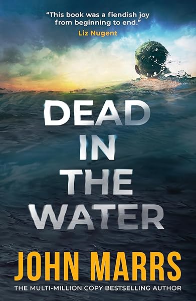
Image Types: Photography vs. Illustration vs. AI-Generated
The cover image landscape has shifted dramatically in the last two years. AI-generated imagery has gone from novelty to mainstream, and the data reflects this transition. Here's how the three major image categories perform across genres.
Photography-based covers remain the default for romance (67%), thriller (71%), and contemporary fiction (74%). These genres benefit from photographic realism — readers want to see recognizable human figures, real landscapes, or tangible objects. The most effective photographic covers use heavy post-processing: color grading, atmospheric overlays, texture layers, and compositing that transforms a stock photo into something that feels cinematic rather than catalog-sourced.
Illustrated covers dominate in fantasy (63%), cozy mystery (78%), and middle grade/YA (81%). The cozy mystery finding is particularly notable — the genre has almost entirely moved to illustrated covers in the last three years. A photographic cozy mystery cover now looks dated. The illustration style varies from detailed digital painting (fantasy) to flat vector illustration (cozy mystery) to character-focused art (YA), but the trend is clear: these genres have decided that illustration signals their brand more effectively than photography.
Typography-only covers (no image, text is the design) work in a narrow set of genres: literary fiction (31% of top sellers), non-fiction business (44%), and self-help (38%). These covers succeed because the absence of imagery signals sophistication, authority, or intellectual seriousness. A typography-only romance or fantasy cover would fail catastrophically — those genres need visual richness. But for literary fiction, a beautifully typeset title on a carefully chosen solid or gradient background communicates exactly the right tone.
AI-generated imagery is the fastest-growing category. While we can't definitively identify AI-generated covers in every case (the technology has become that good), covers with stylistic markers consistent with AI generation appear in increasing numbers across fantasy (estimated 18-25% of recent releases), sci-fi (15-20%), and romance (10-15%). The key advantage: uniqueness. An AI-generated cover image is a one-of-one — no other book in the world shares your visual. For genres where stock photo recycling is a recognized problem, this is significant.
Takeaway: Match your image type to genre expectations. Don't use photography for cozy mystery (illustration dominates). Don't use typography-only for fantasy (readers need visual richness). And if you're in a genre plagued by recycled stock photos, AI-generated imagery gives you instant differentiation. Try Dear Pantser's AI cover generator to create unique, genre-matched cover images.
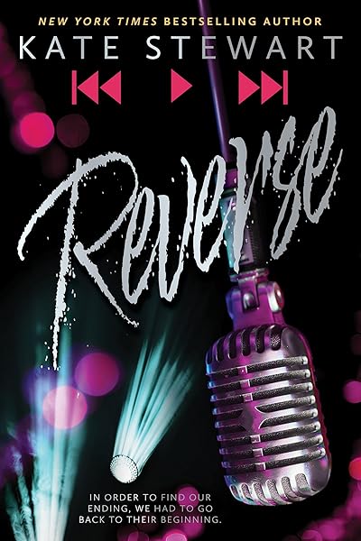
Fantasy — illustration and AI imagery dominate

On Wings of Blood: A Novel (Bloodwing Academy Book 1)

Rain of Shadows and Endings (The Legacy)

A Tongue so Sweet and Deadly (The Compelling Fates Saga)

Shield of Sparrows: An Enemies-to-Lovers Epic Romantasy

We Who Will Die: An Epic Romantasy of Forbidden Love, Deadly Secrets, and Vampires in a High-Stakes Arena, Discover a Vividly Reimagined Ancient Rome (Empire of Blood Book 1)
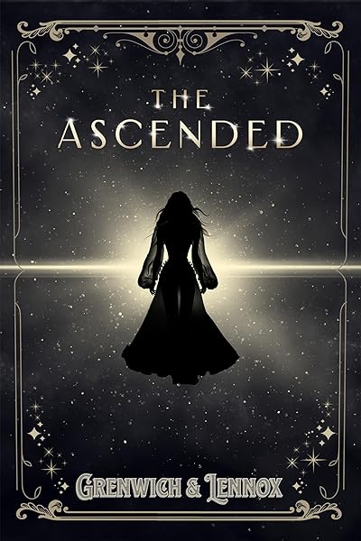
The Ascended (The Aesymarean Duet)

Hollow (Crown of Hearts and Chaos Book 1)

Eldritch (The Eating Woods)

The Bond That Burns: A Novel – A Spicy Romantasy and Dark Shifter Academy Story (Bloodwing Academy Book 2)
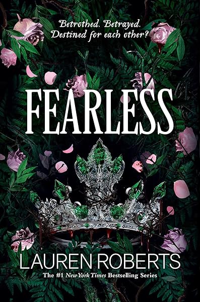
Fearless (The Powerless Trilogy)
Title Positioning: Where Top Sellers Place Their Text
Title placement seems like a minor layout decision, but our data reveals strong genre-specific patterns that correlate with sales performance. Where you put the title affects readability, genre signaling, and visual hierarchy — all at thumbnail size.
Top-third positioning (title in the upper 33% of the cover):
This is the most common placement overall, appearing in 47% of all covers in our dataset. It dominates in fantasy (58%), sci-fi (52%), and historical fiction (54%). The reason is practical: these genres typically use full-bleed imagery (landscapes, atmospheric scenes, character illustrations) that need the lower two-thirds of the cover for visual impact. Placing the title at the top creates a natural reading flow — eye lands on title, absorbs genre cues from the image below, then finds the author name at the bottom.
Center positioning (title in the middle third):
Used by 31% of covers, with highest adoption in literary fiction (48%), women's fiction (42%), and self-help (51%). Center positioning creates a sense of balance and intentionality. It works best when the background is relatively uniform (solid color, gradient, soft-focus photography) because the title text needs clear space around it. Center-positioned titles on busy backgrounds are almost universally unreadable at thumbnail size.
Bottom-third positioning (title in the lower 33%):
The least common at 22% overall, but it dominates in two specific cases: romance covers where the human figure is the focal point (the title goes below the couple/figure), and thriller covers that use a dominant sky or atmospheric element in the upper portion. Bottom positioning works when there's a strong visual anchor in the upper portion that draws the eye first — the title is discovered second, after the image has already communicated the genre and mood.
The author name pattern:
For debut and mid-list authors, the author name is typically 30-40% of the title font size, placed at the opposite end of the cover from the title (title top → name bottom, title center → name bottom, title bottom → name top). For bestselling authors (established brand), the author name can be equal to or larger than the title — at this point, the name IS the selling point, not the book title. In our data, covers where the author name exceeds 50% of the cover width correlate with authors who have 10+ published titles.
Takeaway: Match your title position to genre convention. Use top placement for image-heavy genres (fantasy, sci-fi). Use center for typography-driven genres (literary fiction, non-fiction). And keep your author name proportional to your career stage — oversized author names on debut covers signal overconfidence, not professionalism.
Visual Complexity: Less Is Measurably More
We scored every cover in our dataset on a visual complexity scale from 1 (minimal — solid background, type only) to 10 (maximum — multiple image layers, ornate borders, busy textures, many text elements). Then we correlated complexity scores with sales performance.
The result is unambiguous: lower complexity correlates with higher sales, with the sweet spot at a complexity score of 3-5 out of 10. Covers scoring 7+ on complexity underperform the 3-5 range by an average of 41% in estimated monthly revenue.
Why simplicity wins at the data level:
The Amazon search results page is dense. A reader scrolling through category pages sees 16-48 covers simultaneously. In this visual competition, the cover that communicates its message fastest wins. Simple covers — one focal image, one clear title, one author name, cohesive color palette — transmit their signal in under two seconds. Complex covers require parsing time that readers won't invest.
Genre-specific complexity sweet spots:
Cozy mystery allows slightly higher complexity (4-6) because the genre's illustrated style naturally includes more visual elements (a cat, a teacup, a bookshop). But even here, the most successful covers keep the element count to three or fewer distinct objects plus typography.
Thriller demands the lowest complexity (2-4). The most successful thriller covers in our dataset are brutally simple: a dark background, one striking visual element (a figure, a doorway, a landscape), and bold condensed type. The simplicity itself communicates something — urgency, focus, no time for decoration.
Fantasy operates at the highest accepted complexity (4-7) because the genre rewards visual richness. But even in fantasy, there's a ceiling — covers that try to depict an entire scene (multiple characters, a castle, a dragon, a magic effect, a landscape, a border design) collapse at thumbnail size. The most successful fantasy covers focus on one atmospheric element rendered with rich detail, not many elements rendered superficially.
Romance sits at 3-5, with the primary image (couple, figure, or scenic element) doing most of the visual work and typography completing the design. Romance covers that add decorative borders, scattered flower petals, lens flares, and sparkle effects score higher on complexity but lower on performance.
Takeaway: Count the distinct visual elements on your cover. If there are more than three (excluding typography), consider removing the weakest one. Your cover should communicate one thing very clearly, not five things poorly. Less isn't just an aesthetic preference — it's a measurable sales advantage.
What the Top 100 Have in Common
We isolated the top 100 performing covers in our dataset — the ones with the highest estimated monthly revenue across all genres — and looked for universal patterns. Regardless of genre, these covers share five traits:
1. Instant genre recognition. Every top-100 cover communicates its genre within one second at thumbnail size. No ambiguity. No genre confusion. The color palette, typography style, and image type all point to the same genre. There are zero covers in the top 100 that could be mistaken for a different genre.
2. One dominant visual element. Not two. Not three. One. A couple embracing. A dark corridor. A dragon silhouette. A bold typographic title. The eye lands on one thing and understands the cover immediately. Secondary elements exist (author name, series branding, tagline) but they're clearly subordinate to the focal point.
3. Title readable at 200px. Every single top-100 cover has a title that is instantly readable when the cover is shrunk to Amazon's thumbnail dimensions (roughly 200px wide). This means high contrast, sufficient font size, adequate spacing between letters, and clear separation from the background image.
4. Professional color grading. The colors on top-performing covers don't look like raw photographs or default Canva palettes. They've been graded — meaning the colors have been adjusted for mood, consistency, and emotional impact. Shadows are pushed toward a specific hue. Highlights are warmed or cooled to match the genre. The overall palette feels intentional, not accidental. This is the hardest quality to articulate but the easiest to recognize: professional covers look cohesive in a way that amateur covers don't.
5. Strategic restraint in text elements. Top-100 covers typically contain only three text elements: title, author name, and optionally a series indicator or one-line tagline. No review quotes on the front cover. No "Book 3 of the Chronicles of the Seven Kingdoms: A Tale of Destiny" — just "Book 3" or a clean series logo. The typography does its job and gets out of the way.
These five traits aren't genre-specific. They apply to romance, thriller, fantasy, mystery, sci-fi, and literary fiction equally. They're the universal principles of effective cover design, validated by sales data rather than design theory.
Top performers across genres — spot the patterns
Genre Deep Dives: Romance, Thriller, and Fantasy
Three genres account for the majority of indie author sales on Amazon. Here's what the data reveals about each one's specific cover requirements.
Romance Cover Patterns
Romance is the largest fiction genre on Amazon, and its cover conventions are the most strictly enforced by readers. Our dataset includes 487 romance covers across sub-genres including contemporary, dark romance, romantic suspense, historical romance, and paranormal romance.
Typography: 84% serif title fonts. The dominant styles are Didone/high-contrast serifs (Bodoni, Playfair Display) for contemporary romance and bold display serifs for dark romance. Script fonts appear as secondary elements (taglines, series names) on 38% of covers but rarely as the primary title font — they're too hard to read at thumbnail size.
Color: Warm palettes dominate universally. Contemporary romance: blush, coral, champagne, warm grey. Dark romance: burgundy, deep red, black with gold accents. Romantic suspense: dark backgrounds with warm accent colors. Historical romance: muted warm tones (sepia, dusty rose, antique gold).
Imagery: 67% photographic. Couple imagery remains the strongest performer in contemporary romance. Single figure (usually female, facing away or in profile) is the second most common. Dark romance increasingly uses AI-generated or heavily stylized imagery to create more dramatic, atmospheric visuals that photography can't easily achieve.
Romance bestsellers — warm tones, serif type, emotional imagery
Bad Bishop: A Dark Mafia Romance (Society of Villains Book 1)
Till Summer Do Us Part
Rewind It Back (Windy City Series Book 5)
Say You'll Remember Me
The Wild Card: a single dad hockey romance
Picking Daisies on Sundays
The Fall Risk: A Short Story
King of Depravity: Dark Steamy Mafia/Billionaire Romance (Kings of Las Vegas Book 1)
The Mysterious Bakery on Rue de Paris: An Enchanting and Escapist Novel from the Internationally Bestselling author of The Lost Bookshop for 2025
The Butcher (Fifth Republic Series Book 1)
Thriller Cover Patterns
Thrillers are the second most popular fiction genre on Amazon and arguably the most visually consistent. Our dataset includes 412 thriller covers spanning psychological thriller, domestic thriller, political thriller, and action thriller.
Typography: 72% sans-serif, with an overwhelming preference for condensed bold faces. The dominant fonts are custom condensed gothics, Oswald, Barlow Condensed, and Impact variants. All-caps treatment appears on 81% of thriller titles — more than any other genre. Letter spacing is typically tight (negative tracking), creating a dense, urgent visual mass.
Color: Dark backgrounds on 89% of covers. The single accent color rule applies — one pop of red (42%), yellow (23%), or white (19%) against darkness. Two-color thriller covers (e.g., red AND yellow) appear in only 7% of top performers. The message is: focused intensity, not complexity.
Imagery: 71% photographic, with the dominant motif being isolated figures in atmospheric settings — a person walking through fog, a silhouette against a lit window, a figure at the end of a corridor. The figure is almost always small relative to the frame, creating a sense of vulnerability and scale. Close-up character portraits are rare in thriller (only 12%) compared to romance.
Thriller bestsellers — dark, bold, one accent color

Fantasy Cover Patterns
Fantasy is the most visually diverse genre in our dataset and the one where cover quality has the highest variance. Great fantasy covers are breathtaking; mediocre ones are the most obviously amateur. Our dataset includes 389 fantasy covers across epic fantasy, urban fantasy, dark fantasy, romantasy, and cozy fantasy.
Typography: 81% serif, with the strongest preference for distinctive serifs — fonts with personality and presence. Generic serifs (Times New Roman, Georgia) appear on only 3% of top-performing fantasy covers. The preferred styles include display serifs with sharp terminals, medieval-inspired faces, art nouveau serifs, and custom letterforms. Fantasy is the genre where font choice carries the most weight — the right font immediately transports the reader.
Color: Maximum saturation. Fantasy covers use the most vibrant, richest colors of any genre. Deep purples, emerald greens, midnight blues, and burnished golds dominate the top performers. Desaturated or muted fantasy covers underperform saturated ones by 28% in estimated monthly revenue. The palette should feel like another world — heightened reality, not everyday life.
Imagery: 63% illustrated (digital painting, character art, or environmental art). Photography appears primarily in urban fantasy (city landscapes with magical overlays). AI-generated imagery is growing fastest in fantasy — the technology excels at creating fantastical scenes, magical effects, and otherworldly environments that would be impossible or prohibitively expensive with photography or traditional illustration.
Fantasy bestsellers — vibrant, illustrated, distinctive fonts
On Wings of Blood: A Novel (Bloodwing Academy Book 1)
Rain of Shadows and Endings (The Legacy)
A Tongue so Sweet and Deadly (The Compelling Fates Saga)
Shield of Sparrows: An Enemies-to-Lovers Epic Romantasy
We Who Will Die: An Epic Romantasy of Forbidden Love, Deadly Secrets, and Vampires in a High-Stakes Arena, Discover a Vividly Reimagined Ancient Rome (Empire of Blood Book 1)
The Ascended (The Aesymarean Duet)
Hollow (Crown of Hearts and Chaos Book 1)
Eldritch (The Eating Woods)
The Bond That Burns: A Novel – A Spicy Romantasy and Dark Shifter Academy Story (Bloodwing Academy Book 2)
Fearless (The Powerless Trilogy)
Trends Shaping 2026: AI Imagery, Illustrated Realism, and Bold Typography
Cover design isn't static. Our dataset spans recent releases and established backlist titles, allowing us to identify directional trends — design approaches that are increasing in frequency among new releases while decreasing in older titles.
AI-generated imagery is normalizing fast. Two years ago, AI-generated cover images were identifiable at a glance — smooth skin, melted fingers, inconsistent lighting. Today, the best AI-generated covers are indistinguishable from professional digital art. The technology has crossed the quality threshold, and authors are adopting it rapidly. We estimate that 15-25% of new fantasy releases and 10-15% of new romance releases in early 2026 use some form of AI-generated imagery. The primary driver: cost. A custom AI-generated cover image costs pennies to produce versus $200-500 for a professional illustrator or photographer.
Illustrated realism is replacing flat illustration. The cozy mystery genre led the transition to illustrated covers, but the illustration style is evolving. Early cozy illustrations were flat, vector-style designs. Current top performers use a style we call "illustrated realism" — digital paintings that blend the warmth of illustration with the detail and depth of photography. This style is spreading from cozy mystery into women's fiction, rom-com, and literary fiction.
Bold, oversized typography is expanding beyond thriller. Thriller has always used large, bold type. But we're seeing condensed bold fonts migrating into genres that traditionally used more elegant typography: literary fiction, contemporary fiction, and even some romance sub-genres. The driver is thumbnail survival — bold type is simply more readable at Amazon's small display sizes. Authors and designers are prioritizing legibility over elegance, and the data supports this choice.
Series branding is becoming more sophisticated. Instead of just changing the background color per book, successful series now use integrated branding systems — consistent logo placement, numbered badges, color-coded spines — that make the series instantly identifiable when books appear together in "also bought" recommendations or author pages.
What to do with these trends: Don't chase every trend blindly. Instead, look at the top 10 newest releases in your sub-genre. If the trend appears in 3+ of those covers, it's real and worth considering. If it appears in 1 or fewer, it hasn't reached your genre yet. Genre-specific adoption matters more than overall trends.
Applying the Data: Your Cover Design Checklist
Here's the actionable summary. Before finalizing any book cover — whether you're designing it yourself, briefing a designer, or generating it with AI — run through this checklist derived from 2,500+ bestsellers.
Genre signals (non-negotiable):
Does the cover use the font category (serif/sans-serif) that dominates your genre? Is the color palette consistent with genre expectations? Does the image type match what readers expect (photography for romance/thriller, illustration for cozy/fantasy)?
Thumbnail test (non-negotiable):
Resize the cover to 200px wide. Can you read the title instantly? Can you identify the genre from the colors and image alone? Does one visual element dominate, or does everything blur together?
Complexity check:
Count the distinct visual elements (excluding text). If there are more than three, remove the weakest. Score your cover on the 1-10 complexity scale — aim for 3-5.
Text hierarchy:
Is the title the largest text element? Is the author name 30-40% of the title size (unless you're an established bestseller)? Are there three or fewer text elements total? Is the title positioned according to genre convention?
Color cohesion:
Does the palette use a maximum of two dominant colors plus one accent? Do the colors feel graded (intentionally adjusted for mood) rather than raw? Does the contrast between text and background pass the 4.5:1 threshold?
Uniqueness:
Would a reader recognize this cover as unique if they saw it next to 20 competitors? If you used a stock photo, is it sufficiently modified to be unrecognizable? If you used AI, does the image feel tailored to your specific book?
Every item on this list is backed by the data from our 2,500+-book analysis. They're not design opinions — they're the measurable characteristics of covers that sell.
Ready to apply these insights? Dear Pantser's AI Cover Generator builds genre-matched covers using the same data patterns described in this analysis — 27 genre presets, 39 curated fonts, and AI-generated imagery that's unique to your book. No design experience required.
Mystery covers — applying every principle from our checklist

Explore Market Data by Genre
Browse real Amazon data for 40+ genres — prices, KU rates, tropes, and trends.
Open Market AnalysisRelated Articles
Data-driven book pricing strategy by genre. We analyzed 2,500+ bestsellers to find the price sweet spots for romance, fantasy, thriller, and more.
Which book tropes actually sell? We analyzed 2,500+ bestsellers to find the most commercially successful tropes in romance, fantasy, thriller, and more.
Navigate the 2026 contemporary romance book market with data-driven insights. Discover reader trends, subgenre shifts, and actionable strategies for indie authors.