Book Cover Color Psychology by Genre
How color drives book purchase decisions — backed by bestseller data. Genre-specific color palettes, common mistakes, and the psychology behind why certain colors sell.
Color Sells Books Before a Single Word Is Read
A reader scrolling through Amazon search results makes a decision about your book in under two seconds. In that window, your cover is a 200-pixel-wide thumbnail — too small to read the blurb, too small to appreciate illustration detail, often too small to fully parse the title. What registers first is color.
Research in consumer psychology consistently shows that up to 90% of snap judgments about products are based on color alone. Books are no exception. Color communicates genre, mood, and quality before any other visual element. A dark cover with red accents signals danger, passion, or horror. A soft pastel palette signals lightness, humor, or cozy warmth. A rich gold-and-black combination signals prestige and epic scope.
These associations aren't arbitrary. They're culturally encoded patterns that readers have internalized through thousands of book purchases, movie posters, and brand interactions. When your cover's color palette matches genre expectations, the reader's brain categorizes your book correctly in milliseconds. When it doesn't match, the brain flags a mismatch — and the reader scrolls past.
We analyzed 2,500+ books from Amazon bestseller lists across 27 genre categories to map the color patterns that dominate each genre. The data reveals clear, measurable trends: specific color families correlate with specific genres, and books that break those correlations consistently underperform in click-through rates.
This isn't about being formulaic. It's about speaking the visual language your readers already understand — and then finding creative ways to stand out within that language.
Horror — dark palettes, red/black dominance

The First Witch of Boston: A Novel

On Wings of Blood: A Novel (Bloodwing Academy Book 1)

We Who Will Die: An Epic Romantasy of Forbidden Love, Deadly Secrets, and Vampires in a High-Stakes Arena, Discover a Vividly Reimagined Ancient Rome (Empire of Blood Book 1)
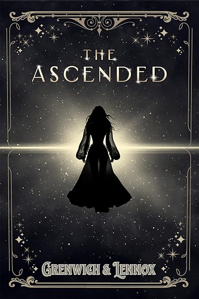
The Ascended (The Aesymarean Duet)

Eldritch (The Eating Woods)
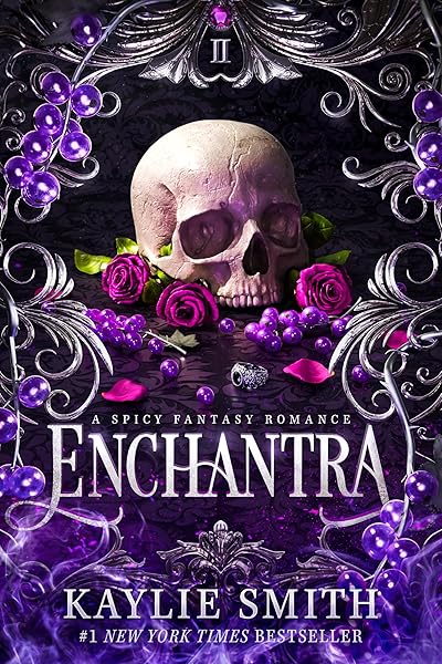
Enchantra: A spicy fantasy romance (Wicked Games Book 2)
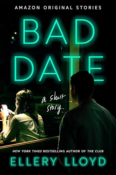
Bad Date: A Short Story

Eleven Numbers: A Short Story

Such Quiet Girls: A Thriller
Abscond: A Short Story
Cozy Mystery — bright pastels, warm tones

No Stress Space Express: A Cozy, Low-Stakes, Slice-of-Life Scifi Adventure
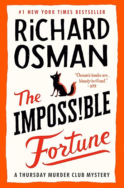
The Impossible Fortune: A Thursday Murder Club Mystery (Thursday Murder Club Mysteries Book 5)
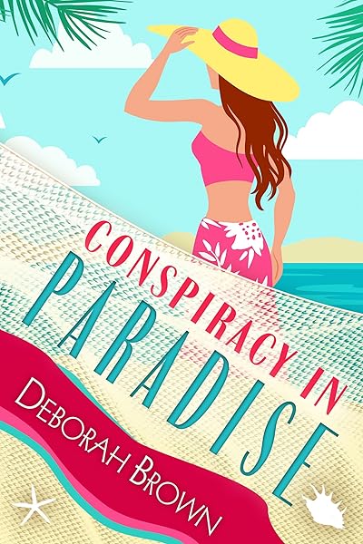
Conspiracy in Paradise (Florida Keys Mystery Series Book 36)

Galactic Green Thumbs: A Cozy, Low-Stakes, Slice-of-Life Sci-fi Adventure (No Stress Space Express Book 9)
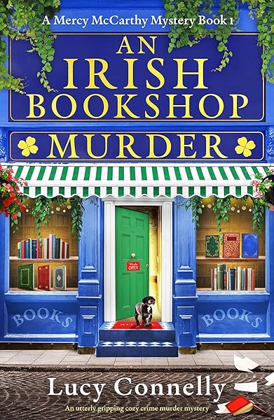
An Irish Bookshop Murder: An utterly gripping cozy crime murder mystery (A Mercy McCarthy Mystery Book 1)
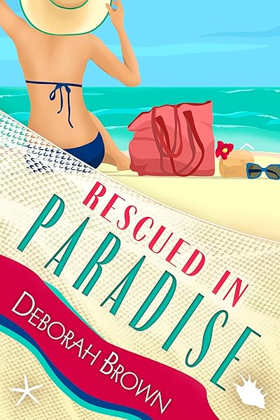
Rescued in Paradise (Florida Keys Mystery Series Book 32)

Hunted in Paradise (Florida Keys Mystery Series Book 33)

Entitled in Paradise

Both Feet In: Wildflower Valley Book Two

Spacebound and Down: A Cozy, Low-Stakes, Slice-of-Life Sci-fi Adventure (No Stress Space Express Book 2)
The Science of Color in Purchase Decisions
Color psychology in marketing isn't pseudoscience — it's one of the most studied areas in consumer behavior. The key insight for book covers is that color operates on two levels simultaneously: emotional association and genre signaling.
Emotional association is universal. Red triggers arousal and urgency. Blue creates calm and trust. Black communicates power and sophistication. Yellow generates optimism and energy. These responses are deeply embedded — they show up consistently across demographics, though cultural context shapes their specific connotations.
Genre signaling is learned. Romance readers have been trained by thousands of covers to associate warm tones (burgundy, blush, gold) with romance. Thriller readers associate dark, desaturated palettes with suspense. These associations are self-reinforcing: publishers use genre-appropriate colors → readers learn the pattern → new authors must match the pattern to be discovered by those readers.
The practical implication is powerful: your cover's dominant color is a genre classification signal. Before a reader processes your title, your author name, or your imagery, their brain has already used color to decide whether your book belongs in a category they care about.
Understanding this dual system — universal emotion plus learned genre association — gives you a framework for making deliberate color choices instead of picking colors you personally like.
How Thumbnails Amplify Color Impact
At full resolution (1600×2560 pixels for a KDP cover), your book is a rich, detailed image. Readers can appreciate subtle gradients, texture variations, and fine typographic details. But most readers will never see your cover at full resolution on their first encounter.
On Amazon search results, your cover appears at roughly 200×300 pixels. On mobile, even smaller. At this scale, detail dissolves. What remains is shape, contrast, and color. A cover that relies on subtle illustration detail or muted tonal variation loses its impact at thumbnail size. A cover built on strong color contrast and clear value separation retains its power.
This is why color choices matter more for book covers than for almost any other design application. Your color palette isn't just an aesthetic choice — it's the primary vehicle of communication at the size most readers will actually encounter your book.
Red: Passion, Danger, and Urgency
Red is the most physiologically activating color. It increases heart rate, triggers attention, and creates a sense of urgency. In book cover design, red serves double duty — it's the dominant accent color for both romance and thriller/horror, but the way it's deployed differs dramatically between genres.
Romance: Red appears as warm, rich tones — burgundy, crimson, ruby, wine. It's often paired with gold accents, soft lighting, and intimate imagery. The red communicates passion, desire, and emotional intensity. In our dataset, dark romance covers use deeper, more saturated reds (approaching maroon and blood-red), while contemporary romance tends toward brighter, warmer reds paired with pink or blush accents.
Thriller and Horror: Red appears as sharp, high-contrast accents against dark backgrounds — black, charcoal, deep navy. The red communicates danger, violence, and urgency. It's used strategically: a red title against a black background, a splash of red (blood, a red door, a red light) in an otherwise monochrome composition. Horror covers in our analysis show 60% of titles using red as the primary accent color, almost always against black.
The critical difference: Romance red is warm, enveloping, and often gradated. Thriller/horror red is sharp, isolated, and high-contrast. A romance cover with cold, sharp red looks like a thriller. A thriller cover with warm, diffused red looks like a romance. The temperature and application of the red matters as much as the color itself.
Practical tip: If your book straddles genres — say, a romantic suspense — use red thoughtfully. Warm red with dark accents (rather than warm accents) splits the difference. The warmth signals romance; the darkness signals danger. Study covers in your specific sub-genre on our genre analysis pages to find the exact balance.
Dark Romance — deep reds, dramatic contrast

Beautiful Venom: A Dark Hockey Romance (Vipers Book 1)

Kiss The Villain: A Dark MM Enemies to Lovers Romance

Rain of Shadows and Endings (The Legacy)

Storm of Secrets and Sorrow (The Legacy Book 2)

A Tongue so Sweet and Deadly (The Compelling Fates Saga)
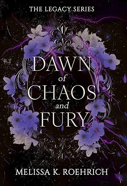
Dawn of Chaos and Fury (The Legacy Book 4)
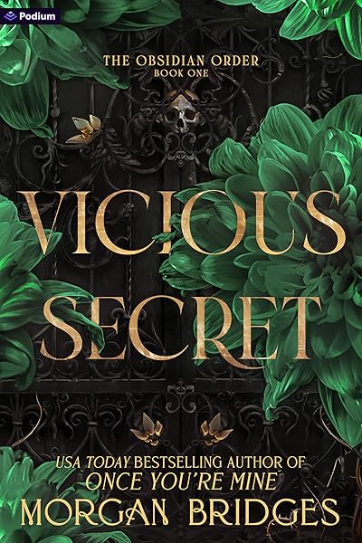
Vicious Secret: A Dark Romance (The Obsidian Order Book 1)
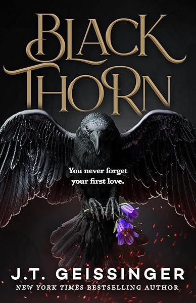
Blackthorn: A Dark Gothic Romance

Wicked Altar: A Dark Irish Mafia Arranged Marriage Romance (The McCarthy Family Legacy)

HIDE AND SEEK: A Dark Stalker Romance (Hide and Seek Series Book 1)
Blue: Trust, Mystery, and Depth
Blue is the most universally liked color across demographics. In consumer psychology, it signals trust, reliability, and calm — which is why it dominates corporate branding. In book covers, blue serves a more nuanced set of roles depending on shade and context.
Mystery and Detective Fiction: Deep, desaturated blues (navy, midnight, steel blue) are the backbone of mystery cover palettes. They create an atmosphere of nighttime, secrecy, and intellectual tension without the visceral urgency of red. Combined with white or silver typography, dark blue communicates "smart thriller" or "whodunit" rather than "violent suspense." In our data, mystery covers overwhelmingly favor blue-gray-black palettes over pure black.
Literary Fiction: Muted, complex blues (slate, teal, dusty blue) appear frequently on literary fiction covers, often paired with minimal typography and restrained layouts. The blue communicates thoughtfulness and emotional depth without genre-specific signaling. Literary fiction uses blue to say "this is serious writing" without saying "this is a thriller."
Science Fiction: Bright, saturated blues (electric blue, cyan, neon blue) signal technology, space, and the future. Sci-fi covers often pair blue with black backgrounds and sans-serif typography to create a clean, technological aesthetic. The blue communicates innovation and vastness — the blue of screens, of deep space, of energy fields.
What blue doesn't work for: Romance (too cold), horror (not visceral enough), cozy mystery (too serious). If your cover's dominant palette is blue and your book is a rom-com, readers will miscategorize it. Blue rom-com covers consistently underperform warm-toned alternatives in our click-through analysis.
Mystery — deep blues and moody atmospherics

What She Saw
Beautiful Venom: A Dark Hockey Romance (Vipers Book 1)

Death to Valentine's Day (The Improbable Meet-Cute: Second Chances)

The Oligarch's Daughter: A Breakneck Spy Thriller

The Good Samaritan

When You Disappeared

In His Wake
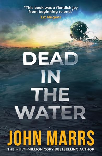
Dead in the Water

No One Knew (Noelle Marshall Book 2)
Bad Date: A Short Story
Black: Power, Horror, and Sophistication
Black isn't a color in the traditional sense — it's the absence of light. On book covers, it functions as a power amplifier. Whatever you place against a black background gains visual weight, drama, and importance. This makes black the dominant choice for genres that deal in extremes.
Horror: Black is foundational. Our analysis of horror bestsellers shows over 70% use predominantly black backgrounds. The logic is straightforward: darkness is the oldest human fear, and black backgrounds create the visual equivalent of a dark room — the reader's eye is drawn to whatever emerges from the darkness (a face, a figure, a title in red or white). Horror covers with light backgrounds read as paranormal romance or urban fantasy, not horror.
Dark Romance and Mafia Romance: Black backgrounds with gold, red, or white typography dominate these sub-genres. The black communicates danger, forbidden territory, and intensity — distinguishing dark romance from mainstream romance's warmer palettes. A dark romance cover on a white or pastel background would be miscategorized instantly.
Thriller and Suspense: Near-black palettes (charcoal, very dark gray, black with subtle texture) create the "can't look away" tension that thriller readers seek. The darkness implies hidden threats, unseen dangers, and moral ambiguity. Combined with stark white or yellow typography, black backgrounds create maximum contrast and visual urgency.
The risk with black: It's easy to make a black cover look generic. When everything is dark, nothing stands out. The best black-dominant covers use a single point of high contrast — one element that pops against the darkness. A pair of eyes. A red door. A glowing title. Without that focal point, a black cover becomes a black rectangle at thumbnail size.
Practical tip: If you're using a black background, your title must have extreme contrast. White, bright red, or metallic gold work. Avoid medium tones (gray, brown, dark blue) for title text on black — they disappear at thumbnail size. Test your cover design at actual thumbnail dimensions before finalizing.
Horror bestsellers — black dominance with high-contrast accents
The First Witch of Boston: A Novel
On Wings of Blood: A Novel (Bloodwing Academy Book 1)
We Who Will Die: An Epic Romantasy of Forbidden Love, Deadly Secrets, and Vampires in a High-Stakes Arena, Discover a Vividly Reimagined Ancient Rome (Empire of Blood Book 1)
The Ascended (The Aesymarean Duet)
Eldritch (The Eating Woods)
Enchantra: A spicy fantasy romance (Wicked Games Book 2)
Bad Date: A Short Story
Eleven Numbers: A Short Story
Such Quiet Girls: A Thriller
Abscond: A Short Story
Gold: Prestige, Fantasy, and Premium Positioning
Gold is the most powerful signaling color in book cover design. It doesn't just communicate a genre — it communicates quality tier. Gold elements (foil effects, metallic textures, gold typography) tell the reader "this is a premium product" before any other information is processed.
Fantasy: Gold is the signature accent color for epic and high fantasy. Combined with rich, saturated backgrounds (deep blue, emerald green, dark red, black), gold typography and ornamental elements create the sense of ancient treasure, royal courts, and mythic grandeur that fantasy readers expect. In our analysis of fantasy bestsellers across 19.4 million Goodreads fantasy books, gold accents appear on the majority of top-performing covers.
Historical Fiction and Historical Romance: Gold communicates era-appropriate luxury and craftsmanship. Historical covers use aged gold tones (antique gold, bronze, warm gold) rather than bright metallic gold, paired with rich background colors (deep green, burgundy, navy) and classical serif typography. The gold says "this story takes you to another time."
Self-Help and Business: Bright, clean gold on dark backgrounds (especially black and navy) signals authority and success. This is the "bestseller" look — think of the gold embossing on traditional hardcover non-fiction. Indie authors writing non-fiction can leverage this association to signal credibility.
How to use gold effectively: Gold works best as an accent, not a dominant color. A cover that's entirely gold looks garish. The most effective approach is gold typography or gold decorative elements against a dark, rich background. The contrast between the warm metallic and the cool darkness creates visual luxury.
Fantasy — gold accents signal epic scope and premium quality
On Wings of Blood: A Novel (Bloodwing Academy Book 1)
Rain of Shadows and Endings (The Legacy)
A Tongue so Sweet and Deadly (The Compelling Fates Saga)

Shield of Sparrows: An Enemies-to-Lovers Epic Romantasy
We Who Will Die: An Epic Romantasy of Forbidden Love, Deadly Secrets, and Vampires in a High-Stakes Arena, Discover a Vividly Reimagined Ancient Rome (Empire of Blood Book 1)
The Ascended (The Aesymarean Duet)

Hollow (Crown of Hearts and Chaos Book 1)
Eldritch (The Eating Woods)

The Bond That Burns: A Novel – A Spicy Romantasy and Dark Shifter Academy Story (Bloodwing Academy Book 2)
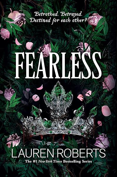
Fearless (The Powerless Trilogy)
Pastels: Cozy, Light, and Approachable
Pastel palettes — soft pink, mint green, lavender, light yellow, baby blue — communicate the exact opposite of black-and-red intensity. They signal lightness, humor, warmth, and accessibility. In book cover design, pastels dominate three specific market segments, and using them outside those segments is a reliable way to miscommunicate your genre.
Romantic Comedy (Rom-Com): Pastel covers have become the defining visual trend of the rom-com boom. Illustrated covers with pastel backgrounds, whimsical typography, and cartoon-style character art dominate the bestseller lists. The pastel palette tells the reader: "this book is fun, light, and will make you smile." The contrast with traditional romance covers (dark, passionate, photographic) is deliberate — rom-com pastels signal "beach read," not "intense love story."
Cozy Mystery: Bright pastels combined with warm tones (coral, peach, sunny yellow) and illustrated elements (cats, teacups, small-town storefronts) define the cozy mystery visual language. The pastels signal that the mystery is a puzzle to solve, not a source of terror. Cozy mystery readers specifically seek out pastel-toned covers because they've learned to associate those colors with the reading experience they want.
Women's Fiction and Book Club Fiction: Soft, muted pastels (dusty rose, sage, powder blue) signal emotional storytelling with a contemplative tone. These covers tend toward a more refined, less whimsical pastel application than rom-com covers — the colors are desaturated and the typography is more restrained.
Where pastels fail: Thriller, horror, hard sci-fi, epic fantasy, military fiction. A pastel-toned thriller cover is an oxymoron. The softness of pastels actively undermines the tension and urgency these genres require. If you're writing dark content with a pastel cover, you're attracting the wrong readers and repelling the right ones.
Cozy Mystery — pastels signal warmth and approachability
No Stress Space Express: A Cozy, Low-Stakes, Slice-of-Life Scifi Adventure
The Impossible Fortune: A Thursday Murder Club Mystery (Thursday Murder Club Mysteries Book 5)
Conspiracy in Paradise (Florida Keys Mystery Series Book 36)
Galactic Green Thumbs: A Cozy, Low-Stakes, Slice-of-Life Sci-fi Adventure (No Stress Space Express Book 9)
An Irish Bookshop Murder: An utterly gripping cozy crime murder mystery (A Mercy McCarthy Mystery Book 1)
Rescued in Paradise (Florida Keys Mystery Series Book 32)
Hunted in Paradise (Florida Keys Mystery Series Book 33)
Entitled in Paradise
Both Feet In: Wildflower Valley Book Two
Spacebound and Down: A Cozy, Low-Stakes, Slice-of-Life Sci-fi Adventure (No Stress Space Express Book 2)
Color Palettes by Genre: The Complete Breakdown
Below is a consolidated reference of the dominant color patterns we identified across our dataset. Each genre's palette isn't a rule to follow blindly — it's a baseline expectation that readers bring to their browsing. Your cover should work within this framework while finding room for creative distinction.
Romance Sub-Genres
Contemporary Romance: Warm tones — blush pink, coral, warm red, gold accents. Often with soft, warm lighting in imagery. Typography in white, gold, or a contrasting script font. The palette should feel inviting and intimate.
Dark Romance: Deep, dramatic palette — black, dark burgundy, charcoal, with red or gold accents. Much darker than mainstream romance. The color shift signals "this romance has edge." Silver and metallic elements appear more frequently than in mainstream romance.
Historical Romance: Rich, saturated jewel tones — emerald, ruby, sapphire, antique gold. The palette should feel period-appropriate: richly colored but not neon. Muted, aged tones work better than bright modern saturations.
Romantic Comedy: Bright pastels and illustrated aesthetics — mint, coral, lavender, sunshine yellow. High brightness, low saturation. The palette should feel cheerful, energetic, and lighthearted. This is the fastest-evolving palette in publishing right now.
Romance — warm, intimate color language

Bad Bishop: A Dark Mafia Romance (Society of Villains Book 1)

Till Summer Do Us Part

Rewind It Back (Windy City Series Book 5)

Say You'll Remember Me

The Wild Card: a single dad hockey romance

Picking Daisies on Sundays

The Fall Risk: A Short Story

King of Depravity: Dark Steamy Mafia/Billionaire Romance (Kings of Las Vegas Book 1)

The Mysterious Bakery on Rue de Paris: An Enchanting and Escapist Novel from the Internationally Bestselling author of The Lost Bookshop for 2025

The Butcher (Fifth Republic Series Book 1)
Thriller and Suspense
Psychological Thriller: Dark, desaturated palette — charcoal, steel blue, cold gray, with white or yellow typography for contrast. Minimal color: one or two accent tones maximum. The palette communicates coldness, isolation, and intellectual tension.
Action Thriller: Slightly warmer darks — black with amber, orange, or fire-red accents. The warmth signals physical danger and explosive action. Movie-poster aesthetics: dramatic lighting, lens flares, silhouettes against orange skies.
Crime Fiction: Urban palette — concrete gray, city-night blue, streetlight amber. These covers often use photography (cityscapes, forensic details) with color grading that desaturates everything except one accent element.
Thriller — dark and desaturated with strategic accents

Fantasy Sub-Genres
Epic/High Fantasy: Rich jewel tones — deep blue, emerald, purple, with gold and silver metallic accents. The palette should feel grand, ancient, and expensive. Map-and-sword aesthetics with ornate decorative elements in metallic tones.
Urban Fantasy: Darker, more modern palette — neon accents (electric blue, magenta, green) against black or dark gray. The neon signals "magic in a modern city." More energetic and contemporary than epic fantasy's classical tones.
Cozy Fantasy: A newer sub-genre with an emerging palette — warm earth tones (terracotta, warm brown, sage green, honey gold) with illustrated aesthetics. The palette bridges fantasy's richness with cozy's warmth, creating a distinct "fireside" visual language that's rapidly establishing its own conventions.
Horror and Dark Fiction
Horror: Black-dominant with red, white, or sickly green accents. The palette should feel oppressive and unsettling. Desaturation is key — horror covers rarely use bright, saturated colors. Even the red accents tend toward darker, more visceral tones (blood red, not cherry red). Our data shows 60% of horror bestsellers are in KU (Kindle Unlimited), where thumbnail differentiation matters even more because readers are browsing rather than searching.
Gothic: Similar to horror but with more purple, dark blue, and antique gold. Gothic covers reference Victorian and Romantic aesthetics — deep, romantic darkness rather than visceral horror. Think thunderstorm palettes: purple-gray skies, black silhouettes, distant warm light.
Horror — oppressive darkness with visceral accents
The First Witch of Boston: A Novel
On Wings of Blood: A Novel (Bloodwing Academy Book 1)
We Who Will Die: An Epic Romantasy of Forbidden Love, Deadly Secrets, and Vampires in a High-Stakes Arena, Discover a Vividly Reimagined Ancient Rome (Empire of Blood Book 1)
The Ascended (The Aesymarean Duet)
Eldritch (The Eating Woods)
Enchantra: A spicy fantasy romance (Wicked Games Book 2)
Bad Date: A Short Story
Eleven Numbers: A Short Story
Such Quiet Girls: A Thriller
Abscond: A Short Story
The Most Common Color Mistakes (And How to Fix Them)
Understanding genre color conventions is only half the equation. The other half is knowing which color mistakes actively hurt your sales. Here are the most common color errors we see in indie cover design.
Mistake #1: Personal preference over genre convention. "I love teal, so my romance cover will be teal." Your readers don't care what colors you like. They care whether your cover looks like a book they want to read. Teal-dominant covers signal literary fiction or contemporary women's fiction — not romance. Using your favorite color instead of genre-appropriate colors is the single most common color mistake indie authors make.
Mistake #2: Too many colors. Professional covers typically use 2-3 colors maximum: a dominant background tone, a complementary accent, and a typography color. Amateur covers often use 5+ colors, creating a chaotic, carnival-poster effect that reads as unprofessional at any size. If your cover palette can't be described in three words, simplify it.
Mistake #3: Wrong temperature for genre. Color temperature (warm vs. cool) is a powerful genre signal. Romance = warm. Thriller = cool. Mixing them (a cool-toned romance, a warm-toned thriller) creates cognitive dissonance. The reader's brain receives conflicting signals and defaults to "skip."
Mistake #4: Insufficient contrast at thumbnail size. Medium tones against medium tones disappear at 200px. Navy text on dark blue. Olive text on forest green. Dusty rose text on pink. These combinations may be visible at full resolution but become invisible at the size Amazon actually displays your cover. Always test contrast at thumbnail dimensions.
Mistake #5: Trendy colors without context. A color that's trending in graphic design (Pantone's Color of the Year, for instance) may be completely wrong for your genre. Book cover color conventions evolve slowly — over years, not months. Chasing design trends over genre conventions will misposition your book.
Fix all five: Before finalizing your color palette, pull up the top 20 bestsellers in your sub-genre. Screenshot them. Squint until the details disappear and only color remains. Your cover's color palette should feel like it belongs in that group. Not identical — but belonging. Use our market analysis tools to study your specific genre's visual patterns.
Color and Kindle Unlimited: Why It Matters Even More
If you're publishing in Kindle Unlimited — and if you're an indie author in romance, fantasy, thriller, or horror, you likely are — color psychology becomes even more critical. Here's why.
KU readers browse rather than search. They scroll through category pages, recommendations, and "also bought" carousels looking for their next read. Unlike a reader who searched for a specific title, a KU browser is making rapid, subconscious decisions about dozens of thumbnails in sequence. Your cover needs to pass the genre-recognition test faster than on a search results page, because the reader is scrolling faster.
KU readers are also more genre-loyal than purchase readers. They consume more books (often 10+ per month) and are deeply fluent in genre visual conventions. A KU romance reader has seen thousands of romance covers and has an extremely refined subconscious pattern-matching system. A cover that's even slightly off-genre will register as "not for me" instantly.
The data backs this up: in our analysis, genres with high KU penetration (horror at 60%, romance and fantasy both above 40%) show the strongest color convention adherence among bestsellers. The books that perform best in KU are the ones that signal genre most clearly — and color is the primary signal at thumbnail scale.
Conversely, genres with lower KU penetration (literary fiction, non-fiction) show more color diversity among bestsellers. These readers are more likely to search by author name or title, reducing the importance of thumbnail-level genre signaling.
Building Your Cover's Color Strategy
Armed with color psychology and genre data, here's a practical framework for choosing your cover's color palette.
Step 1: Identify your genre's dominant palette. Look at the top 20-30 bestsellers in your specific sub-genre. Not your genre — your sub-genre. Dark romance has a completely different palette than contemporary romance. Note the dominant background colors, accent colors, and typography colors. Our genre pages show you actual bestseller covers side by side.
Step 2: Choose a dominant color from that palette. Your cover's background or primary fill should come from the range you identified in Step 1. This is your genre signal — the color that tells readers "this is a [genre] book" at thumbnail size.
Step 3: Select one accent color. This is the color that creates contrast and draws the eye to your focal point (usually your title). The accent should complement your dominant color and match genre conventions. Red accent on black for horror. Gold accent on deep blue for fantasy. Warm accent on rich background for romance.
Step 4: Define your typography color. This must have maximum contrast against whatever sits directly behind your text. White on dark backgrounds. Black on light backgrounds. Gold or metallic on medium backgrounds. Never assume your typography is readable — always test at 200px.
Step 5: Test against comp titles. Place your cover thumbnail alongside your genre's bestsellers. Does it look like it belongs? Not identical — but part of the same family? If a reader squinting at the group would correctly identify your cover's genre, your color strategy is working.
Ready to apply this? Our cover design tool lets you generate genre-matched covers with AI-powered imagery and professional typography. Color palettes are automatically calibrated to your genre's conventions — so you start from a position of genre accuracy and customize from there.
Professional covers — color palettes matched to genre conventions

Color Trends Shifting in 2026
While core genre color conventions are stable, some notable shifts are emerging in 2026 that are worth tracking.
Illustrated covers are changing color expectations. The rise of illustrated (non-photographic) covers, particularly in romance, fantasy, and cozy genres, is expanding acceptable color palettes. Illustrated covers can use more saturated, stylized color than photo-based covers without looking unrealistic. This is allowing sub-genres like romantasy to develop entirely new color vocabularies (rich jewel tones + romantic warmth) that wouldn't work with photographic imagery.
Dark romance is getting darker. Where dark romance once used burgundy and charcoal, the current trend pushes toward true black with minimal, high-contrast accents. Silver is replacing gold as the preferred metallic. The palette is converging with horror aesthetics, reflecting the sub-genre's increasingly transgressive content.
Cozy fantasy is establishing its own palette. As cozy fantasy emerges as a distinct commercial category, its color language is crystallizing: warm earth tones, autumn-inspired palettes, hand-drawn illustration style with warm lighting. It's neither traditional fantasy (jewel tones + metallic) nor traditional cozy (pastels + brightness) — it's a new synthesis that readers are learning to recognize.
Neon accents in urban fantasy and sci-fi. Electric blue, hot pink, and acid green accents against dark backgrounds are becoming more prevalent, influenced by cyberpunk aesthetics and gaming visual culture. These covers stand out powerfully at thumbnail size because neon-on-black is one of the highest-contrast combinations possible.
The underlying principle hasn't changed: match your genre's current visual language, then find room to stand out within it. But "current" is the key word — genre palettes evolve, and the covers that sell best are the ones that feel contemporary, not dated.
Try These Ideas on Your Cover
Open the cover editor and preview fonts, colors, and layouts on your book cover.
Open Cover EditorRelated Articles
How AI book cover generators work, what they cost vs traditional designers, and when to use each option. Based on analysis of 2,500+ bestselling covers across 27 genres.
Cost, speed, quality, and uniqueness — a data-driven comparison of AI-generated book covers vs traditional designer covers. With real numbers and blind test results.
The definitive guide to book cover typography. 25 genre-specific font pairings used by professional publishers, with visual previews and licensing tips.