Book Cover Design Trends 2026: What's Working Now
The biggest book cover design trends in 2026 — illustrated covers, bold typography, dark aesthetics, pastel rom-com, and more. Data from 2,500+ bestsellers across 27 genres.
Book Covers in 2026: A Year of Visual Revolution
2026 bestseller covers — spot the trends


Book cover design has never evolved faster than it is right now. The convergence of AI image generation, shifting reader demographics, and platform algorithm changes is reshaping what "professional" looks like on Amazon, Barnes & Noble, and every other bookshelf — physical or digital.
We analyzed 2,500+ books from Amazon bestseller lists across 27 genre categories to identify the visual trends dominating 2026. Some are accelerations of patterns that started in 2024-2025. Others are genuinely new. All of them are visible in the data: the covers that sell the most consistently follow specific, measurable visual patterns.
Understanding these trends isn't about chasing fads. It's about understanding what today's readers respond to when they're scanning a page of thumbnails at 200 pixels wide, deciding which book to click on next. Your cover is your most important marketing asset — and like all marketing, it needs to speak the visual language of the present, not the past.
Here are the seven trends reshaping book cover design in 2026, with data, examples, and actionable advice for each.
Trend #1: Illustrated Covers Are Replacing Stock Photos
The single biggest shift in book cover design over the past two years is the move from photographic to illustrated covers. What started as a rom-com trend in 2023-2024 has spread to romance, fantasy, cozy mystery, women's fiction, middle grade, and young adult — and shows no signs of slowing down.
The numbers tell the story. In our 2026 bestseller dataset, illustrated covers appear in the top 20 of every major romance sub-genre, up from roughly 30% in late 2024. In cozy mystery and cozy fantasy, illustrated covers now represent the dominant aesthetic — a non-illustrated cozy cover stands out as the exception, not the norm.
Why the shift happened:
BookTok and Bookstagram drove demand. Illustrated covers photograph better for social media. They pop in Instagram grid layouts and TikTok video backgrounds. The flat, stylized aesthetic of illustration reads better on screens than the depth-of-field, lighting-dependent look of photography. Readers who share book recommendations visually (and that's an increasingly large segment) gravitate toward covers that look good in a social media context.
AI image generation made illustration affordable. Previously, commissioning a custom illustration cost $500-2,000+. AI can generate illustrated cover imagery in the $1-5 range. This hasn't just made illustration cheaper — it's made illustration accessible to every author. The barrier that kept illustration as a premium option has collapsed.
Stock photo fatigue is real. Readers have seen the same stock models, the same poses, the same photo processing on thousands of covers. Illustration feels fresh, unique, and personal in comparison. An illustrated cover signals "this author cares enough to have something custom" — even when the illustration costs less than the stock photo it replaced.
What this means for you: If you're publishing in romance, cozy, YA, or women's fiction and still using stock photography, you're swimming against the current. Illustrated covers aren't just a trend — they're becoming the genre expectation. Readers in these genres now associate stock-photo covers with older titles or lower production values. That association, fair or not, affects click-through rates.
Action step: Study the current top 20 in your sub-genre. If more than half use illustrated covers, the tipping point has passed — you need illustration to compete. Check your genre's current visual landscape →
Romance 2026 — illustrated covers dominate the bestseller list
Bad Bishop: A Dark Mafia Romance (Society of Villains Book 1)
Till Summer Do Us Part
Rewind It Back (Windy City Series Book 5)
Say You'll Remember Me
The Wild Card: a single dad hockey romance
Picking Daisies on Sundays
The Fall Risk: A Short Story
King of Depravity: Dark Steamy Mafia/Billionaire Romance (Kings of Las Vegas Book 1)
The Mysterious Bakery on Rue de Paris: An Enchanting and Escapist Novel from the Internationally Bestselling author of The Lost Bookshop for 2025
The Butcher (Fifth Republic Series Book 1)
Trend #2: Bold, Oversized Typography
Typography has always mattered on book covers, but 2026 marks a shift toward typography as the primary design element — not supporting text over an image, but the visual centerpiece of the cover itself.
This trend manifests differently across genres:
Thriller and suspense leads the charge. The most successful thriller covers in our dataset use massive, condensed bold type that fills 50-70% of the cover's width. The title isn't placed on the image — it is the image. Think thick, heavy letterforms with texture, grain, or distress effects. The background is secondary: a muted photograph, a solid color, or a subtle gradient that exists only to provide contrast for the type.
Literary fiction embraces oversized type for different reasons. Where thrillers use bold type for impact and urgency, literary fiction uses large type for elegance and statement-making. Clean serif or contemporary sans-serif fonts, set very large, with generous white space. The message: "this book is confident enough to let the title speak for itself."
Horror has adopted distorted, textured typography as a genre signal. Hand-drawn letterforms, type with cracks and decay, dripping or bleeding effects — the typography itself becomes part of the horror aesthetic. This is a significant departure from horror's traditional reliance on imagery (faces, landscapes, creatures) to set the mood.
Why it works at thumbnail size: Oversized typography solves the thumbnail readability problem that kills so many indie covers. If your title occupies 50%+ of the cover width, it's legible at any reproduction size. A reader scrolling quickly through Amazon can read a bold typographic cover title in under a second — faster than they can process a detailed photographic image.
The data confirms this: covers in our dataset where the title occupies more than 40% of the cover width show higher representation in the top 10 across thriller, literary fiction, and horror sub-genres. Readability at thumbnail scale is a competitive advantage.
Thriller 2026 — bold typography dominates the composition


Trend #3: Dark and Moody Aesthetics Across Genres
Dark covers are expanding beyond their traditional territory. While horror, thriller, and dark romance have always favored dark palettes, 2026 sees darkness creeping into mainstream romance, fantasy, and even some contemporary fiction.
The drivers are cultural and algorithmic:
Reader taste is shifting darker. The "dark romance" explosion of 2024-2025 normalized darker aesthetics across romance as a whole. Readers who discovered they enjoyed dark romance — now one of the fastest-growing sub-genres — carry those visual preferences to adjacent genres. A contemporary romance with a moody, atmospheric cover no longer reads as "misgenred thriller." It reads as "contemporary romance with edge."
Dark covers pop on bright screens. Amazon's white background, Kindle's white home screen, and social media's bright interfaces all create a context where dark covers stand out through contrast. A dark cover surrounded by white UI elements draws the eye. A light cover on a white background can blend into the interface.
The data by genre:
Horror: Over 70% of top-performing covers use predominantly dark backgrounds. Red, white, and sickly green accents. This is not new — but the darkness is getting more extreme. Pure black backgrounds with minimal elements, rather than dark-but-detailed atmospheric scenes.
Dark Romance: Black backgrounds with metallic accents (gold, silver, rose gold) are the dominant pattern. The genre has developed a distinct visual language that's almost luxury-branding adjacent — think high-fashion editorial in the darkness.
Fantasy: Deep, rich backgrounds (midnight blue, forest green, near-black purple) with luminous elements. The trend is away from the bright, saturated fantasy covers of the early 2020s toward moodier, more atmospheric compositions. Gold and silver metallic accents provide the necessary contrast.
Mainstream Romance: The surprise entry. Warm-toned dark covers (deep burgundy, chocolate, dark teal) with warm lighting effects are appearing in the mainstream romance top 20 — genres that were pastel and bright just two years ago. The darkness isn't horror-dark; it's intimate-dark. Candlelit, atmospheric, cozy-in-the-darkness.
Key insight: Dark doesn't mean somber. The most effective dark covers use strategic points of warmth or brightness — a glowing title, a warm light source, a metallic accent — that create depth and visual interest within the darkness. A flat black rectangle is boring. A dark cover with a single luminous element is magnetic. Experiment with dark palettes in our cover design tool →
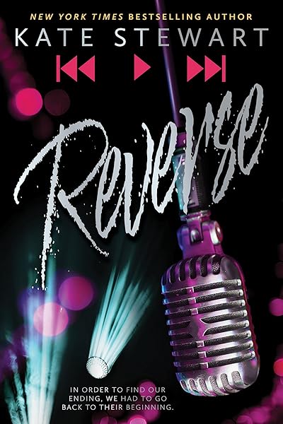
Dark Romance — luxury darkness with metallic accents

Beautiful Venom: A Dark Hockey Romance (Vipers Book 1)

Kiss The Villain: A Dark MM Enemies to Lovers Romance

Rain of Shadows and Endings (The Legacy)

Storm of Secrets and Sorrow (The Legacy Book 2)

A Tongue so Sweet and Deadly (The Compelling Fates Saga)
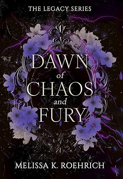
Dawn of Chaos and Fury (The Legacy Book 4)
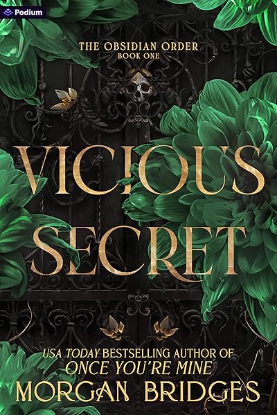
Vicious Secret: A Dark Romance (The Obsidian Order Book 1)
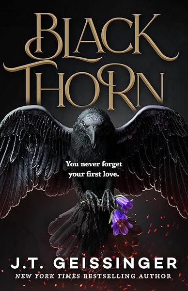
Blackthorn: A Dark Gothic Romance

Wicked Altar: A Dark Irish Mafia Arranged Marriage Romance (The McCarthy Family Legacy)

HIDE AND SEEK: A Dark Stalker Romance (Hide and Seek Series Book 1)
Horror — extreme darkness, minimal elements
The First Witch of Boston: A Novel

On Wings of Blood: A Novel (Bloodwing Academy Book 1)

We Who Will Die: An Epic Romantasy of Forbidden Love, Deadly Secrets, and Vampires in a High-Stakes Arena, Discover a Vividly Reimagined Ancient Rome (Empire of Blood Book 1)
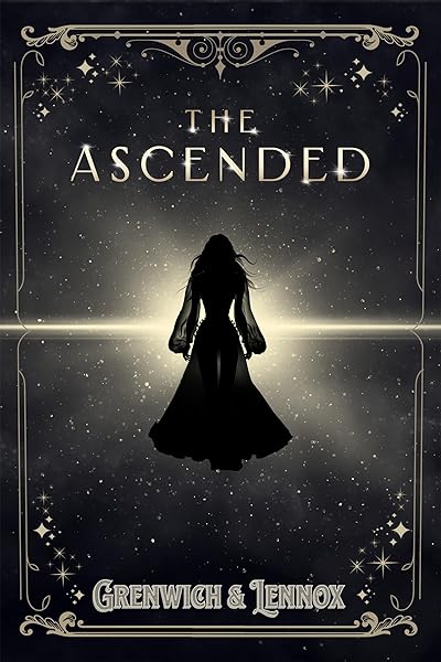
The Ascended (The Aesymarean Duet)

Eldritch (The Eating Woods)
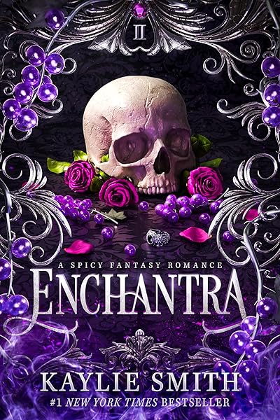
Enchantra: A spicy fantasy romance (Wicked Games Book 2)
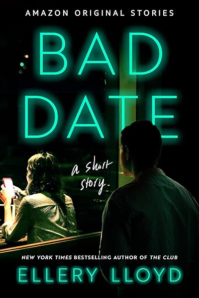
Bad Date: A Short Story

Eleven Numbers: A Short Story

Such Quiet Girls: A Thriller
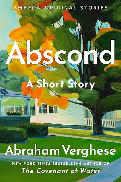
Abscond: A Short Story
Trend #4: The Pastel Rom-Com Aesthetic
While darkness spreads across some genres, the rom-com corner of publishing has doubled down on the exact opposite: bright pastels, illustrated characters, and playful typography. This isn't just a continuation of the 2024 trend — it's an intensification.
The 2026 pastel rom-com cover follows a remarkably consistent template:
Solid pastel background — mint green, lavender, soft coral, sunshine yellow, baby blue. Flat color, no gradients, no texture. The background is a canvas for the illustration, not a design element in itself.
Illustrated characters — one or two cartoon-style figures in dynamic poses (falling, reaching, caught mid-laugh). The illustration style ranges from editorial (clean lines, minimal detail) to fully rendered (shading, texture, depth). Either style works, but the characters must be in motion. Static poses read as boring.
Playful, oversized title — hand-drawn or display fonts, often in a contrasting bold color. The title is large, confident, and slightly irreverent. Thin, formal fonts are a genre mismatch here.
Why this template works: It's instantly recognizable at thumbnail size. A reader scrolling through Amazon knows within milliseconds that a pastel-background illustrated cover is a rom-com. That genre signal is so strong that the specific illustration details don't matter at thumbnail scale — the color palette alone does the work.
The business implication is significant: rom-com covers are now cheaper and faster to produce well. A flat pastel background with illustrated characters is simpler to generate (via AI or traditional illustration) than a photographic cover requiring model licensing, photo editing, and complex compositing. The trend toward illustration has actually lowered the production bar for one of publishing's largest commercial genres.
Rom-Com 2026 — pastel palettes and illustrated characters
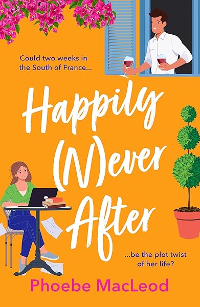
Happily Never After: A hilarious, uplifting romantic comedy from Phoebe MacLeod for 2026

The Cowboy's Game: A Romantic Comedy (A Pride and Pranks Romance)

It Started with a Text: A Mistaken Identity MM Romantic Comedy Novella (Queer Ways to Fall in Love Book 2)
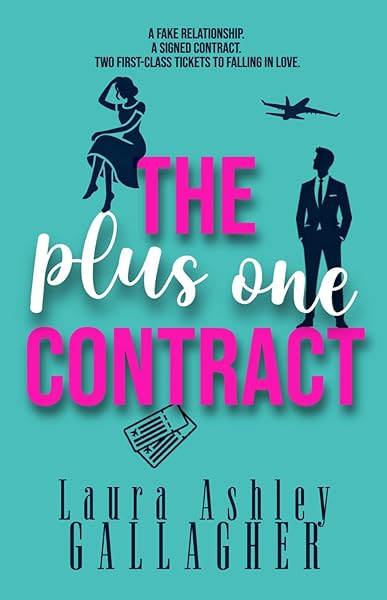
The Plus One Contract (Skeptically In Love)

Mr. Absolutely Not!: A Romantic Comedy (The Seattle Svenssons Book 1)
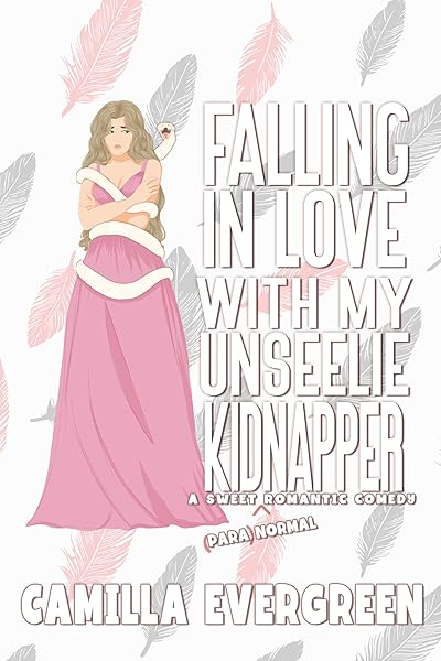
Falling in Love with My Unseelie Kidnapper: A Sweet Romantic Comedy (That's (Para)Normal Book 6)
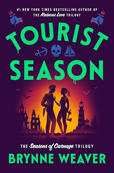
Tourist Season (The Seasons of Carnage Trilogy Book 1)
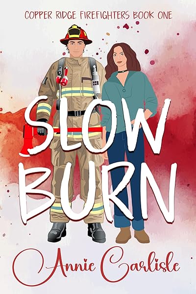
Slow Burn: A Single Dad Firefighter Romantic Comedy (Copper Ridge Book 1)

No Axe To Grind: A Grumpy Mountain Man Romantic Comedy (Ashwood Falls Book 1)

The Complete Mapleton Series: A Steamy Small Town Romantic Comedy Collection
Trend #5: Gold Foil and Metallic Effects in Fantasy
Fantasy covers have always used gold. What's new in 2026 is the sophistication and prominence of metallic effects — they've moved from accent detail to primary design element.
In our analysis of fantasy bestsellers across 19.4 million Goodreads-listed fantasy books, the top-performing covers increasingly use metallic elements not just for title text but for ornamental frames, decorative borders, symbolic emblems, and full typographic treatments. The gold foil effect that was once a physical printing technique (actual metallic foil applied to hardcovers) has become a digital design aesthetic applied to ebook thumbnails.
The sub-genre variations:
Epic Fantasy: Gold and bronze metallic on deep blue, emerald, or black backgrounds. Ornate frames and heraldic elements. Classical serif typography in gold. The aesthetic references illuminated manuscripts, royal seals, and ancient artifacts. The message: "this is a grand story in a richly built world."
Romantasy: Rose gold and copper metallic on deep jewel tones. The metallic warmth bridges fantasy's grandeur with romance's intimacy. Floral and organic ornamental elements rather than geometric or heraldic ones. This sub-genre is establishing its own visual language that's distinct from both pure fantasy and pure romance.
Dark Fantasy: Silver and platinum metallic on black. The cold metallic tones communicate danger and moral ambiguity within the fantasy framework. Combined with angular, sharp decorative elements rather than flowing organic ones.
Why metallic works at thumbnail size: Metallic effects create the illusion of light on the cover. At thumbnail size, where detail disappears, a cover that appears to glow or shimmer draws the eye. The contrast between dark backgrounds and luminous metallic elements survives reduction to 200px in a way that subtle color variations don't.
Practical note: Digital gold foil effects depend on contrast. Gold on a medium-toned background disappears. Gold on near-black or deep jewel tones pops. If you're using metallic effects, maximize the value contrast between your metallic elements and the background. See what's working in fantasy right now →
Fantasy 2026 — metallic effects as primary design elements
On Wings of Blood: A Novel (Bloodwing Academy Book 1)
Rain of Shadows and Endings (The Legacy)
A Tongue so Sweet and Deadly (The Compelling Fates Saga)

Shield of Sparrows: An Enemies-to-Lovers Epic Romantasy
We Who Will Die: An Epic Romantasy of Forbidden Love, Deadly Secrets, and Vampires in a High-Stakes Arena, Discover a Vividly Reimagined Ancient Rome (Empire of Blood Book 1)
The Ascended (The Aesymarean Duet)

Hollow (Crown of Hearts and Chaos Book 1)
Eldritch (The Eating Woods)

The Bond That Burns: A Novel – A Spicy Romantasy and Dark Shifter Academy Story (Bloodwing Academy Book 2)
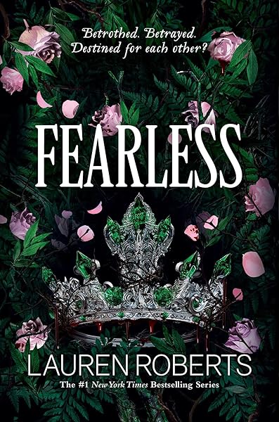
Fearless (The Powerless Trilogy)
Trend #6: Minimalist Literary Fiction
At the opposite end of the design spectrum from fantasy's ornate metalwork, literary fiction is trending toward radical minimalism. The most successful literary fiction covers in 2026 use fewer elements, more white space, and quieter color palettes than at any point in recent memory.
The archetype: a single symbolic object or abstract shape, one or two colors, a clean serif title, generous margins. Nothing competes for attention. The cover breathes. The implicit message: "this book is thoughtful, intentional, and respects your intelligence."
The design elements:
Single symbolic object: A key, a house, a flower, a bird, a chair. One item that suggests the book's theme without illustrating its plot. The object is often rendered simply — a line drawing, a silhouette, a flat-color shape — rather than photographically.
Restrained palette: Two colors maximum. Often a muted or desaturated pair: cream and navy, white and olive, pale blue and charcoal. Bright, saturated colors are almost absent from literary fiction covers in 2026. The palette communicates restraint, taste, and seriousness.
Typography-forward: The title set in a high-quality serif or elegant contemporary sans-serif, sized large enough to be the primary visual element. The font choice alone signals literary fiction — Garamond, Caslon, Freight, Tiempos. No decorative scripts, no condensed impacts, no playful display fonts.
Why minimalism works for literary fiction specifically: Literary fiction readers are the most likely to judge a cover's design quality rather than its visual drama. They respond to restraint, craft, and intentionality — the same values they seek in prose. A maximalist literary fiction cover signals the wrong things: it looks like genre fiction, which tells a literary reader "this isn't for me." The minimalism is the signal.
For indie authors writing literary fiction, this trend is good news. Minimalist covers are among the most achievable for non-designers. You don't need illustration skills, photo editing expertise, or complex compositing. You need one strong concept, one good font, and the discipline to stop adding elements.
Trend #7: Cinematic Atmosphere and Mood Lighting
The final major trend of 2026 cuts across genres: covers are becoming more cinematic. The aesthetic reference point is shifting from "book cover" to "movie poster" — with dramatic lighting, atmospheric depth, and compositions that feel like a still frame from a film.
This trend is most visible in:
Thriller and suspense: Covers that look like they were pulled from a Netflix thriller — shallow depth of field, dramatic side-lighting, figures emerging from shadow. The color grading mimics film: teal-and-orange, desaturated with one warm accent, blue-hour atmospheric tones.
Fantasy: Epic landscape compositions with dramatic skies, volumetric light (god rays, mist, auroras), and tiny figures that establish scale. The "fantasy movie poster" look — think the marketing materials for Game of Thrones, Lord of the Rings, or Shadow and Bone.
Horror: Film-grain textures, VHS distortion effects, found-footage aesthetics. The covers reference horror film visual language — not just the content of horror films, but their medium. Grainy, deteriorated, unsettling on a material level.
Why cinematic covers work: Readers consume more visual media than ever. Their aesthetic expectations are calibrated by Netflix, Disney+, and streaming platform marketing — all of which use high-production cinematic imagery. A book cover that matches this visual sophistication reads as "professional" and "current" to a reader whose visual standards are set by streaming platforms, not by other book covers.
The AI connection: AI image generation models are particularly good at producing cinematic atmospheres — dramatic lighting, depth of field, atmospheric perspective, volumetric effects. These are areas where AI often outperforms stock photography, because stock photographers rarely shoot with book-cover-specific dramatic lighting. This means the cinematic trend is more accessible to indie authors using AI tools than it would be using traditional stock-photo-based design.
To achieve the cinematic look: Focus on lighting direction, color grading, and atmospheric depth. A flat, evenly-lit image reads as "stock photo." A dramatically-lit image with depth and atmosphere reads as "cinematic." The subject matters less than the light. Generate cinematic covers with AI-powered tools →
Thriller — cinematic color grading and atmosphere
Fantasy — epic scale, dramatic lighting
On Wings of Blood: A Novel (Bloodwing Academy Book 1)
Rain of Shadows and Endings (The Legacy)
A Tongue so Sweet and Deadly (The Compelling Fates Saga)
Shield of Sparrows: An Enemies-to-Lovers Epic Romantasy
We Who Will Die: An Epic Romantasy of Forbidden Love, Deadly Secrets, and Vampires in a High-Stakes Arena, Discover a Vividly Reimagined Ancient Rome (Empire of Blood Book 1)
The Ascended (The Aesymarean Duet)
Hollow (Crown of Hearts and Chaos Book 1)
Eldritch (The Eating Woods)
The Bond That Burns: A Novel – A Spicy Romantasy and Dark Shifter Academy Story (Bloodwing Academy Book 2)
Fearless (The Powerless Trilogy)
Trends That Are Fading in 2026
Understanding what's on the way out is as important as understanding what's on the way in. Here are the design patterns that are declining in 2026.
Unedited stock photography. Covers that use a stock photo with minimal processing — no compositing, no color grading, no custom effects — look dated. Readers associate unedited stock photos with self-published books from 2018-2022. The bar has risen. Even if you're using stock photography, it needs significant creative treatment to compete.
Bright, busy compositions. Covers crammed with multiple characters, detailed scenes, and competing visual elements are losing ground to simpler, higher-impact compositions. The thumbnail test is merciless: busy covers become indistinct blurs at 200px. The trend across all genres is toward fewer elements, more impact.
Dated font choices. Papyrus, Comic Sans, and Bleeding Cowboys have been memes for years, but subtler typographic anachronisms are also fading. Fonts that were trendy in 2020-2022 (certain geometric sans-serifs, ultra-thin weights, overly decorative scripts) now look like they belong to a specific era. If your cover's typography feels "familiar but not current," it may be using a font that peaked 3-4 years ago. Check our font guide for current recommendations.
Fake 3D and emboss effects. Drop shadows, bevel effects, and faux-3D typography that were common on indie covers are disappearing. The trend is toward flat or subtly textured design — effects that feel digital-native rather than emulating physical print techniques poorly.
The "serious author" headshot. Back-cover author photos styled like corporate headshots (studio lighting, formal pose, neutral background) are being replaced by candid, warm, personality-driven photos. This isn't a cover trend per se, but it reflects the same broader shift: authenticity and personality over formality and convention.
How to Apply These Trends to Your Next Cover
Trends are data points, not mandates. Here's how to use this information without becoming a trend-chaser who redesigns their cover every quarter.
1. Check your genre first. Not every trend applies to every genre. Illustrated covers dominate rom-com but would look strange on a military thriller. Dark aesthetics work for fantasy but would miscommunicate a cozy mystery. Always filter trends through your specific sub-genre's current visual language. The genre pages on our site show you exactly what's working now: romance, fantasy, thriller, horror.
2. Adopt macro trends, ignore micro trends. The shift from photography to illustration is a macro trend — it reflects deep changes in reader behavior and production economics. It's worth adapting to. A specific color shade being popular this quarter is a micro trend — it'll change in months. Focus on the structural shifts, not the surface variations.
3. Update covers for backlist titles. If your backlist covers use visual patterns from 3+ years ago, they're aging you out of browse traffic. A cover refresh using current trends can revive a flatlined title. This is one of the highest-ROI activities in self-publishing — and with AI tools, it costs almost nothing.
4. Test before you commit. Generate multiple cover variations reflecting different trends. Use Amazon ads to A/B test them. Let reader behavior — actual clicks, actual sales — determine which trend resonates with your specific audience. Data beats opinion.
5. Don't redesign what's working. If your current cover is generating strong click-through rates and steady sales, don't change it just because it doesn't match the latest trend. Trends inform new covers and underperforming covers. A working cover is a working cover.
Ready to design with 2026 trends? Our AI-powered cover tool generates genre-matched covers using current visual patterns — illustrated or photographic, dark or bright, typographic or image-driven. Start from what's working now and make it your own. Explore market data to see exactly what's selling in your genre. And use our blurb writer and plot development tools to build the complete package that turns browsers into readers.
Try These Ideas on Your Cover
Open the cover editor and preview fonts, colors, and layouts on your book cover.
Open Cover EditorRelated Articles
The definitive guide to book cover typography. 25 genre-specific font pairings used by professional publishers, with visual previews and licensing tips.
How color drives book purchase decisions — backed by bestseller data. Genre-specific color palettes, common mistakes, and the psychology behind why certain colors sell.
Unlock the secrets of captivating fantasy book cover design. Learn genre tropes, visual trends, and how to create covers that sell your epic tales.