10 Cover Design Mistakes That Kill Book Sales
The most common book cover mistakes indie authors make — and how to fix them. Based on analysis of thousands of bestselling covers.
Why Your Cover Matters More Than Your Writing
Here's a truth most authors refuse to accept: readers judge books by their covers. Not metaphorically — literally. Your cover is the first and often the only thing a potential reader sees before deciding whether to click, scroll past, or pick up your book.
On Amazon, where the majority of indie book sales happen, your cover appears as a thumbnail roughly 200 pixels wide. That's smaller than a credit card on screen. A reader scrolling through search results or a category page gives your cover about two seconds of attention before moving on. Two seconds. That's not enough time to read a blurb, check reviews, or evaluate your writing. It's barely enough time to process an image.
In those two seconds, your cover communicates three things: genre, quality, and tone. If any of those signals are wrong — or worse, absent — the reader scrolls past. It doesn't matter if you've written the next great American novel. If the cover looks like it was assembled in PowerPoint during a lunch break, readers will assume the writing inside matches the effort on the outside.
A mediocre book with a professional cover will outsell a brilliant book with an amateur cover. This isn't cynical — it's math. The cover determines click-through rate. Click-through rate determines visibility. Visibility determines sales. The best writing in the world can't overcome zero clicks.
We analyzed 2,500+ books from Amazon bestseller lists across 27 genre categories to identify the most common cover design mistakes — the ones that consistently separate books that sell from books that don't. Here are the ten mistakes we see most often, and how to fix each one.
What professional covers look like


Mistake #1: Wrong Genre Signals
Every genre has a visual language. Romance covers use warm tones, script or display serif fonts, and images of couples or intimate moments. Thrillers use dark backgrounds, condensed bold type, and isolated figures or urban landscapes. Fantasy covers use rich colors, classical serifs, and mythic or atmospheric imagery. These aren't arbitrary aesthetic choices — they're genre conventions that readers use to identify books they'll enjoy.
When your cover breaks these conventions, readers don't think "how refreshingly original." They think "this isn't for me" and scroll past. Or worse, they think "this author doesn't know what they're doing."
The most common genre-signal mistakes we see:
Romance with sans-serif titles. Romance readers expect script fonts, display serifs, or elegant hand-lettered type. A clean sans-serif title (Helvetica, Arial, Montserrat as the title font) signals non-fiction, self-help, or literary fiction — not romance. With 14 million romance books on Goodreads, competition is fierce. Your cover must instantly signal "romance" or you lose the reader to the 50 other thumbnails on screen.
Thrillers with decorative fonts. Thriller and suspense readers expect urgency: condensed type, dark palettes, minimal elements. A thriller with a flowing script title or a pastel color scheme looks like a cozy mystery or a rom-com. The reader won't click because they can't tell it's a thriller.
Fantasy with modern minimalism. Fantasy readers — all 19.4 million of them on Goodreads — want grandeur. A fantasy cover with a plain white background and a thin sans-serif title looks like contemporary literary fiction. You need texture, depth, and serif fonts that feel like they belong on an ancient tome.
Fix: Before designing your cover, study the top 20 bestselling covers in your specific sub-genre. Not your genre — your sub-genre. Dark romance looks nothing like cozy romance. Military sci-fi looks nothing like space opera. Identify the visual patterns (colors, fonts, imagery, layout) and make sure your cover speaks the same language.
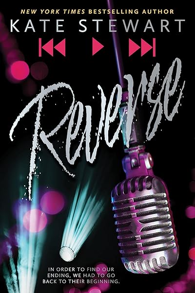
Romance bestseller covers — notice the visual patterns
Bad Bishop: A Dark Mafia Romance (Society of Villains Book 1)
Till Summer Do Us Part
Rewind It Back (Windy City Series Book 5)
Say You'll Remember Me
The Wild Card: a single dad hockey romance
Picking Daisies on Sundays
The Fall Risk: A Short Story
King of Depravity: Dark Steamy Mafia/Billionaire Romance (Kings of Las Vegas Book 1)
The Mysterious Bakery on Rue de Paris: An Enchanting and Escapist Novel from the Internationally Bestselling author of The Lost Bookshop for 2025
The Butcher (Fifth Republic Series Book 1)
Mistake #2: Unreadable Typography at Thumbnail Size
This is the single most common mistake we see on indie book covers, and it's the easiest to test for. If a reader can't read your title at 200 pixels wide — the actual size Amazon displays in search results — your cover has failed its most basic job.
The culprits are predictable:
Thin fonts on busy backgrounds. A light-weight font (Raleway Thin, Lato Light) placed over a detailed illustration or photograph becomes invisible at thumbnail size. The letterforms don't have enough visual mass to separate from the background. You need either a heavier font weight or a solid/gradient bar behind the text.
Decorative scripts at small sizes. Script and calligraphic fonts can be gorgeous at full resolution, but many become illegible at thumbnail size. The connecting strokes between letters merge into an unreadable squiggle. If you're using a script font, test it specifically at 200px width — many scripts that look beautiful at 1600px collapse at 200px.
Low contrast between text and background. White text on a pale sky. Dark blue text on a dark background. Gold text on a warm-toned image. At full resolution, these might be readable. At thumbnail size, they disappear. You need a contrast ratio of at least 4.5:1 between your text and the area directly behind it.
Title text that's too small. Some authors try to fit a long title, a subtitle, the author name, and a series tagline all on the cover, giving each element roughly equal size. The result is that nothing is readable at thumbnail size. Your title should occupy at least 30-40% of the cover's width.
Fix: Export your cover design and resize it to 200×300 pixels. If you can't instantly read the title, change the font, increase the size, add a contrast bar behind the text, or simplify the title. This five-second test eliminates the majority of typography problems.
See genre-tested font pairings that pass the thumbnail test →
Thriller covers — bold, readable at any size


Mistake #3: Too Many Elements
Amateur covers try to illustrate the plot. Professional covers capture the mood.
The difference is enormous. An amateur romance cover might include a couple embracing, a castle in the background, a horse, a sunset, a rose border, and a wax seal — because the book contains all of those elements. A professional romance cover uses one striking image (the couple, or even just a silhouette) with strong typography and lets the image do the emotional work.
When you crowd a cover with too many elements, several things go wrong simultaneously:
No focal point. The reader's eye doesn't know where to land. In those critical two seconds of attention, the eye bounces between elements without processing any of them. A cover with one clear focal point communicates instantly.
Reduced text readability. Every additional image element is another area of visual noise competing with your title text. More elements = more busy background = less readable typography.
Looks unprofessional. Visual clutter is the most reliable indicator of an amateur cover. Professional designers understand that white space is a feature, not a bug. Empty space creates breathing room, draws attention to the elements that remain, and makes the overall design feel intentional.
Thumbnail collapse. At 200px wide, all those carefully arranged elements merge into an indistinct blur. The horse becomes a brown smudge. The wax seal becomes a red dot. The rose border becomes visual noise. Simpler covers survive the thumbnail reduction because their core composition is built from larger, bolder shapes.
Fix: Pick one image or concept that captures the mood of your book. Not the plot — the mood. What should the reader feel when they see the cover? Design around that single emotional beat. If you can describe your cover's concept in more than one sentence, it's too complicated.
Mistake #4: Using Obvious Stock Photos
Readers recognize overused stock photos. They may not consciously think "I've seen that exact image before," but they register a sense of familiarity that strips the cover of its uniqueness and signals mass-produced content.
The worst offenders are well-known in the indie publishing community:
The shirtless man. A small number of male stock models appear on hundreds — sometimes thousands — of romance covers. Readers have seen the same torso, the same jaw, the same smoldering look on so many covers that it's become a running joke in BookTok and Bookstagram communities.
The woman in a field. A woman standing alone in a meadow, forest, or wheat field, usually facing away from the camera. This image appears on literary fiction, romance, women's fiction, historical fiction, and even some fantasy covers. It communicates nothing about your specific book.
The dark forest path. A shadowy trail through trees, used interchangeably for mystery, thriller, horror, fantasy, and literary fiction. When every genre uses the same image, the image loses its ability to signal any specific genre.
The magnifying glass or fingerprint. Mystery covers rely on these visual clichés so heavily that they've become invisible. Readers' eyes slide right past them because the brain has categorized them as visual noise.
Fix: You have several options. AI-generated imagery creates completely unique visuals tailored to your specific book — no other cover in the world will share your image. Heavily modified stock photos (recolored, composited, overlaid with textures and effects) can also work, as long as the original photo is unrecognizable. Illustrated covers are inherently unique but require either artistic skill or a budget for a professional illustrator. The key principle: your cover image should feel like it was created for your book, not selected from a catalog.
Fantasy bestsellers — unique imagery that stands out

On Wings of Blood: A Novel (Bloodwing Academy Book 1)

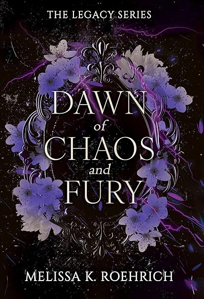
Rain of Shadows and Endings (The Legacy)

A Tongue so Sweet and Deadly (The Compelling Fates Saga)

Shield of Sparrows: An Enemies-to-Lovers Epic Romantasy

We Who Will Die: An Epic Romantasy of Forbidden Love, Deadly Secrets, and Vampires in a High-Stakes Arena, Discover a Vividly Reimagined Ancient Rome (Empire of Blood Book 1)
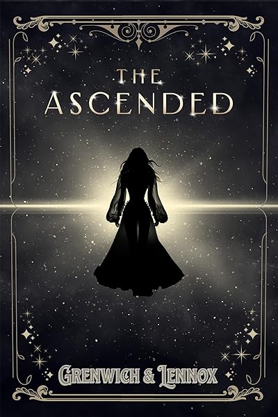
The Ascended (The Aesymarean Duet)

Hollow (Crown of Hearts and Chaos Book 1)

Eldritch (The Eating Woods)

The Bond That Burns: A Novel – A Spicy Romantasy and Dark Shifter Academy Story (Bloodwing Academy Book 2)
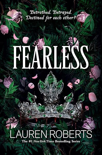
Fearless (The Powerless Trilogy)
Mistake #5: DIY with Canva Templates
Canva is an excellent tool for social media graphics, presentations, and marketing materials. It is a poor tool for book covers, and the results are almost always identifiable at a glance.
The template problem. Canva's book cover templates are used by thousands of authors. When your cover uses the same layout, the same decorative elements, and the same font combinations as hundreds of other books in your genre, readers notice the sameness even if they can't articulate why. Your cover looks like a template because it is a template.
The resolution problem. Canva defaults to 72 DPI for screen display. Amazon requires 300 DPI for print covers, and even ebook covers benefit from higher resolution for zoom functionality and retina displays. A cover designed at 72 DPI will look blurry when printed and soft when zoomed — both of which signal amateur production quality.
The dimension problem. Canva's default book cover template isn't always set to Amazon's recommended 1600x2560 pixels (1:1.6 ratio). If your cover dimensions don't match Amazon's requirements, your image may be cropped, stretched, or display with unwanted borders. Print covers are even more demanding — they require exact spine width calculations based on page count and paper type, plus bleed areas that Canva doesn't handle natively.
The font problem. Canva's font library, while large, doesn't include many of the genre-standard display fonts that professional cover designers use. You end up choosing from the same subset of fonts that every other Canva user selects, further contributing to the template look.
Fix: Use tools designed specifically for book covers. Dear Pantser provides 39 genre-curated fonts, correct Amazon dimensions, and 27 genre presets — all built specifically for book covers, not repurposed from social media templates. If budget allows, hiring a professional cover designer remains the gold standard. Services like BookBrush also offer book-specific templates. The common thread: use tools that understand book cover requirements, not general-purpose design platforms.
Mistake #6: Wrong Dimensions
Amazon has specific dimension requirements for book covers, and they're different for ebooks and print. Getting them wrong results in covers that look distorted, cropped, or surrounded by ugly borders — all of which scream "this author didn't do their homework."
Amazon ebook covers: 1600x2560 pixels minimum, with a 1:1.6 aspect ratio. This is the standard that ensures your cover displays correctly in the Kindle Store, on Kindle devices, and in the Kindle app across all platforms.
Amazon print covers (KDP): Dimensions vary based on your chosen trim size. A 6"x9" book requires a different cover than a 5"x8" book. Additionally, print covers require spine width (calculated from page count and paper type) and bleed area (0.125" on all sides). The total cover file is a single image that wraps around the entire book: back cover + spine + front cover.
The most common dimension error: Designing at a 1:1.5 ratio (standard photo ratio) instead of 1:1.6. The difference is subtle when viewed in isolation, but on Amazon your cover will be slightly shorter than surrounding covers, with visible padding at the top and bottom. In a grid of thumbnails, your cover looks smaller and less polished than competitors who used the correct ratio.
The second most common error: Placing important text or imagery too close to the edges. Print covers require bleed, and ebook covers can be slightly cropped on some devices. Keep all critical content at least 0.25 inches from any edge.
Fix: Always start with the correct dimensions. For ebooks, design at 1600x2560 pixels. For print, use KDP's cover calculator to determine exact dimensions based on your trim size, page count, and paper type. Never try to "eyeball" a cover ratio — start with a properly sized canvas from the beginning.
Mistake #7: Inconsistent Series Covers
If you're writing a series, your covers must look like they belong together. This isn't optional — it's one of the most important factors in readthrough, the metric that measures how many readers who buy book 1 go on to buy book 2, 3, 4, and beyond.
When a reader finishes book 1 and searches for book 2, they scan visually. They look for a cover that matches the one they just read. If book 2 has a completely different font, a different layout, a different color palette, or a different illustration style, the reader hesitates. That hesitation costs you sales.
What must stay consistent across a series:
Font pairing. The same title font and author font on every book. No exceptions. Even switching from one serif to another serif creates a jarring disconnect.
Layout structure. Title position, author position, and the general composition of text-to-image should be identical. If book 1 has the title at the top, every book in the series should have the title at the top.
Color system. This doesn't mean every cover should be the same color — in fact, varying the dominant color per book helps readers identify individual volumes. But the type of colors (saturated vs. muted, warm vs. cool) and the way colors are applied (gradient overlay, solid bar, tinted photography) should follow a consistent system.
Illustration style. If book 1 uses digital illustration, book 2 shouldn't switch to photography. If book 1 uses a moody atmospheric landscape, book 2 shouldn't feature a character portrait. The imagery approach must be consistent even as the specific images change.
Fix: Design your template system before publishing book 1. Create a cover template with locked positions for title, author, and series branding, then swap only the background image and dominant color for each subsequent book. Dear Pantser's 22 starter covers curated by genre are designed as series-ready templates — each one defines a reusable layout system, not just a single cover.
Dark Romance series


Cozy Mystery series

No Stress Space Express: A Cozy, Low-Stakes, Slice-of-Life Scifi Adventure
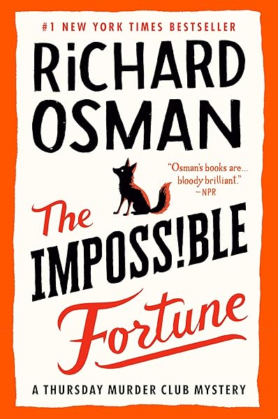
The Impossible Fortune: A Thursday Murder Club Mystery (Thursday Murder Club Mysteries Book 5)
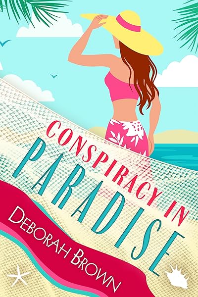
Conspiracy in Paradise (Florida Keys Mystery Series Book 36)

Galactic Green Thumbs: A Cozy, Low-Stakes, Slice-of-Life Sci-fi Adventure (No Stress Space Express Book 9)
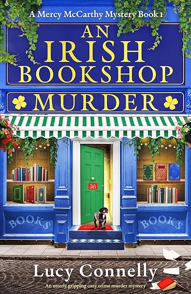
An Irish Bookshop Murder: An utterly gripping cozy crime murder mystery (A Mercy McCarthy Mystery Book 1)
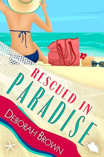
Rescued in Paradise (Florida Keys Mystery Series Book 32)
Mistake #8: Ignoring Color Psychology
Color is the fastest-processing visual element on a book cover. Before a reader reads your title, before they process the illustration, their brain has already registered the dominant color and made an emotional judgment. Using colors that contradict your genre's emotional expectations creates cognitive dissonance — the reader feels that something is "off" without knowing why.
Here's what the bestseller data shows about color associations by genre:
Red: Passion, danger, urgency. Dominant in romance (especially dark romance and romantic suspense) and thriller covers. Red creates immediate emotional intensity and stands out in thumbnail grids. It's the most attention-grabbing color in the spectrum, which is why it works for genres that promise strong emotional experiences.
Blue: Trust, calm, depth. Common in literary fiction, mystery (especially cozy mystery), and women's fiction. Blue creates a sense of reliability and contemplation. It's the most universally liked color, making it a safe choice when your genre doesn't have a strong color convention — but that safety can also make it forgettable.
Black: Power, sophistication, darkness. Essential for dark romance, horror, and urban fantasy. Black backgrounds create maximum contrast for light-colored text and convey a sense of edge and intensity. In our analysis of 6.5 million mystery books on Goodreads, dark palettes with pops of a single accent color dominated the top sellers.
Gold: Prestige, history, magic. The go-to accent color for fantasy, historical fiction, and high-end literary fiction. Gold foil effects (or their digital equivalents) signal premium quality and epic scope. Gold title text on a dark background is one of the most reliably effective combinations in fantasy covers.
Neon/bright: Energy, youth, modernity. Dominant in YA fiction, sci-fi, and contemporary thrillers. Neon colors (hot pink, electric blue, acid green) against dark backgrounds create a cyberpunk or high-energy aesthetic that appeals to younger demographics and tech-forward genres.
Pastels: Lightness, warmth, approachability. The defining palette of rom-com, cozy mystery, and women's fiction. Pastel covers signal "this is a fun, light read" — using them on a dark thriller or hard sci-fi would immediately confuse the reader.
Fix: Match your dominant color to your genre's emotional frequency. Study the top 20 covers in your sub-genre and note the dominant colors. If 15 of them use dark palettes with red accents, your lavender-and-cream cover will look out of place regardless of how beautiful it is in isolation.
Horror — dark palettes, red/black dominance
The First Witch of Boston: A Novel
On Wings of Blood: A Novel (Bloodwing Academy Book 1)
We Who Will Die: An Epic Romantasy of Forbidden Love, Deadly Secrets, and Vampires in a High-Stakes Arena, Discover a Vividly Reimagined Ancient Rome (Empire of Blood Book 1)
The Ascended (The Aesymarean Duet)
Eldritch (The Eating Woods)
Cozy Mystery — bright pastels, warm tones
No Stress Space Express: A Cozy, Low-Stakes, Slice-of-Life Scifi Adventure
The Impossible Fortune: A Thursday Murder Club Mystery (Thursday Murder Club Mysteries Book 5)
Conspiracy in Paradise (Florida Keys Mystery Series Book 36)
Galactic Green Thumbs: A Cozy, Low-Stakes, Slice-of-Life Sci-fi Adventure (No Stress Space Express Book 9)
An Irish Bookshop Murder: An utterly gripping cozy crime murder mystery (A Mercy McCarthy Mystery Book 1)
Mistake #9: Author Name Bigger Than Title
There's a simple rule for author name sizing that most indie authors get backwards: unless readers already know your name, your name is not the selling point.
Stephen King can put his name in 72-point type because "Stephen King" is a genre unto itself. His name sells more books than any title or cover image could. The same applies to Nora Roberts, James Patterson, John Grisham, and a handful of other household names. For these authors, the name is the brand.
For everyone else — which includes the vast majority of indie authors — the title does the selling. The title communicates the concept, sets the tone, and gives the reader a reason to click. The author name is secondary information that the reader processes after they've already decided the book is interesting.
When an unknown author's name dominates the cover, it creates two problems:
It steals visual space from the title. The title needs to be large enough to read at thumbnail size. Every pixel of height given to the author name is a pixel taken from the title. On a 200px thumbnail, there isn't room for two large text blocks — one must dominate, and it should be the title.
It signals misplaced confidence. Readers are sophisticated. They know that big-name authors earn prominent name placement through decades of bestselling work. An unfamiliar name displayed at the same visual weight as the title feels presumptuous and, more importantly, amateurish. It's a tell — it reveals that the author is imitating the surface-level appearance of famous-author covers without understanding why those covers are designed that way.
Fix: The title should have 2-3x the visual weight of the author name. "Visual weight" means the combination of font size, boldness, and color contrast. Your author name should be clearly readable but visually subordinate. As your readership grows and your name becomes recognizable, you can gradually increase the author name size — but only when the name itself has become a selling point.
Notice: title dominates, author name is secondary
On Wings of Blood: A Novel (Bloodwing Academy Book 1)
Rain of Shadows and Endings (The Legacy)
A Tongue so Sweet and Deadly (The Compelling Fates Saga)
Shield of Sparrows: An Enemies-to-Lovers Epic Romantasy
We Who Will Die: An Epic Romantasy of Forbidden Love, Deadly Secrets, and Vampires in a High-Stakes Arena, Discover a Vividly Reimagined Ancient Rome (Empire of Blood Book 1)
The Ascended (The Aesymarean Duet)
Hollow (Crown of Hearts and Chaos Book 1)
Eldritch (The Eating Woods)
Mistake #10: Not Testing Before Publishing
You've been staring at your cover for hours — maybe days. You've adjusted the kerning, tweaked the color grade, repositioned the title three times. You're satisfied. You upload it to Amazon.
This is a mistake. You have cover blindness — the same phenomenon that causes writers to miss typos in their own manuscripts. You've looked at the cover so many times that you can no longer see it objectively. You read the title because you know what it says, not because the typography is actually legible. You see the genre signals because you know the genre, not because the cover communicates them clearly.
The fix requires external feedback, and there are several levels of testing:
The genre test. Show your cover to 10 people who read your genre (not friends and family who "think it looks nice"). Ask them one question: "What genre is this book?" If more than 2 out of 10 guess wrong, your genre signals are broken. Don't explain or defend — redesign.
The thumbnail test. Send your cover to someone as a 200px-wide image — the actual Amazon thumbnail size. Ask: "Can you read the title?" and "Would you click on this?" Their first reaction is the data point. If they squint, hesitate, or say "I think it says...", the typography needs work.
The comparison test. Place your cover in a grid alongside the top 10 bestsellers in your genre. Does it look like it belongs? Does it stand out for the right reasons (strong design) or the wrong reasons (amateur quality)? If it looks like the odd one out, investigate why.
The A/B test. Once your book is live, Amazon Ads lets you A/B test covers with real shoppers for as little as $5/day over 3 days. Create two cover variants, run them as separate ad campaigns targeting the same keywords, and compare click-through rates. This is real market data from real readers — infinitely more valuable than any opinion.
Fix: Build testing into your publishing process. No cover goes live without at least the genre test and the thumbnail test. Budget $15-30 for an Amazon Ads A/B test on your top 2 candidates. The cost is trivial compared to the sales you'll lose with an untested cover.
How to Fix a Bad Cover Without Starting Over
If you've recognized your cover in one or more of these mistakes, the good news is that you don't necessarily need to start from scratch. Many cover problems can be fixed with targeted adjustments that preserve what's already working while correcting what isn't.
Font swap. This is the single highest-impact change you can make. Replacing an inappropriate or illegible font with a genre-correct, thumbnail-readable alternative can transform a cover from amateur to professional in minutes. A thriller cover with a script title? Swap to Bebas Neue or Anton. A romance cover with a sans-serif? Swap to Great Vibes or Abril Fatface. The image underneath might be perfectly fine — it's the typography that's failing.
Color correction. If your genre signals are off because of color, a background recolor or overlay can fix it without changing the underlying image. Warming up a cold-toned romance cover, darkening a thriller that's too bright, or adding a gold tint to a fantasy cover are straightforward adjustments that dramatically shift the genre perception.
Title size and position. If your cover fails the thumbnail test, increasing the title size by 20-30% and ensuring it sits in the upper third of the cover (where the eye naturally lands first) often solves the readability problem. This may mean reducing the author name size or removing a subtitle — both acceptable tradeoffs.
Element reduction. If your cover is too busy, start removing elements from the edges inward. Secondary images, decorative borders, taglines, review quotes — strip everything that isn't the title, author name, and one central image. Usually, the simpler version is the stronger version.
Contrast enhancement. Adding a semi-transparent dark gradient behind light text, or a light gradient behind dark text, can make previously invisible typography pop without changing the cover's overall look. This is the fastest fix for covers where the text gets lost against a busy background.
The Dear Pantser cover editor is built specifically for these kinds of targeted fixes. You can swap fonts from a library of 39 genre-curated typefaces, adjust colors, reposition text, and preview at thumbnail size — all without losing your base image or starting a new design from zero.
Before you go — study what works
Try These Ideas on Your Cover
Open the cover editor and preview fonts, colors, and layouts on your book cover.
Open Cover EditorRelated Articles
A data-driven breakdown of DIY, premade, AI, and custom designer book covers — real costs, time investment, quality comparison, and ROI calculations for indie authors.
How AI book cover generators work, what they cost vs traditional designers, and when to use each option. Based on analysis of 2,500+ bestselling covers across 27 genres.
Cost, speed, quality, and uniqueness — a data-driven comparison of AI-generated book covers vs traditional designer covers. With real numbers and blind test results.