Thriller Book Cover Design: The Ultimate Author's Guide
Unlock the secrets of compelling thriller book cover design. Learn essential elements, genre conventions, and data-backed strategies to captivate readers and boost sales.
The Pulse-Pounding Power of Thriller Book Cover Design
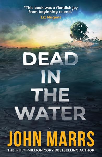
Top-Selling Thriller Covers


In the high-stakes world of thriller fiction, your book cover isn't just an image; it's a silent scream, a whispered threat, a promise of heart-stopping suspense. It's the single most critical marketing tool an indie author possesses, especially in a genre as competitive and visually driven as thrillers. A poorly designed cover can bury your masterpiece, while an exceptional one can launch it into the bestseller lists. This guide will dissect the anatomy of a successful thriller book cover, providing data-backed insights and actionable strategies to help you design a cover that not only grabs attention but compels readers to click 'buy'.
We'll explore the psychological triggers embedded in color palettes, the narrative power of typography, and the genre-specific imagery that signals 'thriller' to potential readers. Understanding these elements is crucial because, according to a recent study, 79% of readers admit to judging a book by its cover, and for thrillers, that number is likely even higher due to the genre's reliance on immediate emotional impact. Your cover needs to convey tension, mystery, and a sense of urgency within milliseconds of a reader seeing it.
Understanding the Thriller Reader's Psychology
Before diving into design specifics, it's vital to understand what a thriller reader is looking for. They crave excitement, suspense, and a plot that keeps them guessing. They want to be immersed in a world of danger, intrigue, and high stakes. Their decision-making process is often driven by an emotional response to the cover. Does it make their pulse quicken? Does it hint at a compelling mystery? Does it promise a rollercoaster ride?
Data shows that covers evoking strong emotions, such as fear, curiosity, or anticipation, perform significantly better in the thriller category. This means your cover shouldn't just be aesthetically pleasing; it must be psychologically engaging. Think about the feeling you want to evoke – a creeping dread, a sudden shock, or the unsettling calm before a storm. Your visual choices, from the color scheme to the focal point, must align with this emotional objective.
The Core Elements of a Winning Thriller Cover
Every effective thriller book cover design is built upon a foundation of key elements. Mastering these components is essential for creating a cover that resonates with your target audience and stands out in a crowded marketplace.
Color Palettes: The Mood Setters
Color is arguably the most powerful emotional trigger on a book cover. For thrillers, certain palettes have become genre staples because they effectively convey tension, danger, and mystery. Dark, muted tones like deep blues, charcoal grays, and blacks are dominant, often contrasted with sharp, unsettling bursts of red, orange, or stark white. These contrasts create a visual tension that mirrors the narrative tension within the book.
For instance, a crimson splash against a dark background immediately signals blood, violence, or urgency. A lonely, cold blue palette can evoke isolation and dread. Studies on visual perception indicate that colors like red and black are associated with danger and power, making them ideal for thriller covers. Avoid overly bright or pastel colors, as these tend to diminish the sense of seriousness and suspense that thriller readers expect.
Typography: More Than Just Words
The font you choose for your title and author name is not merely decorative; it's an integral part of your thriller book cover design. Bold, sans-serif fonts are common, often appearing distressed, fractured, or slightly off-kilter to suggest instability and danger. Think about fonts that convey a sense of urgency, mystery, or even a subtle threat.
For example, a title rendered in a sharp, angular font can evoke precision and danger, while a slightly blurred or distorted font might suggest a psychological twist or an unreliable narrator. The placement and sizing of your title are also crucial; it should be immediately readable and often dominates the cover, demanding attention. Subtitles or taglines should be concise and intrigue-building, using a complementary, legible font.
Imagery and Composition: Telling a Story in a Glimpse
The central image or composition of your thriller cover is where the narrative hook truly lies. Common motifs include solitary figures, shadowy silhouettes, ominous landscapes, urban decay, weapons, or abstract patterns that suggest chaos or a hidden secret. The goal is to create a sense of mystery or impending doom without giving away the entire plot.
Composition often employs asymmetry, leading lines that draw the eye to a focal point of tension, or negative space to create a feeling of emptiness or isolation. A lone car on a winding road, a figure standing at the edge of a cliff, or a distorted reflection in a window are classic examples. The key is to imply a story, not to illustrate it literally. This allows the reader's imagination to fill in the blanks, increasing their engagement.
Subgenres of Thriller: Tailoring Your Design
The thriller genre isn't a monolith; it's a vast landscape with numerous subgenres, each with its own subtle visual cues. A psychological thriller cover will differ significantly from a political thriller or a technothriller. Understanding these nuances is critical for effective book cover design.
General Thriller


Psychological Thrillers: The Mind Game
For psychological thrillers, covers often focus on unsettling imagery that hints at mental distress, fractured realities, or hidden motives. Common elements include blurred faces, fragmented objects, distorted reflections, or abstract patterns that evoke confusion or internal conflict. Color palettes tend to be muted, perhaps with a single, jarring accent color. Typography might be slightly distressed or uneven, suggesting a mind on the brink. The goal is to create unease and curiosity about the inner workings of the characters.
Political & Espionage Thrillers: Global Stakes
These covers often feature iconic landmarks, maps, government buildings, or shadowy figures in suits. The color palette typically leans towards cool blues, grays, and blacks, conveying seriousness and high stakes. Typography is usually clean, professional, and bold, reflecting the formal nature of the genre. The imagery suggests global conspiracies, clandestine operations, and powerful, unseen forces. Think stark contrasts and strong lines.
Crime & Legal Thrillers: Justice on the Line
Covers for crime and legal thrillers frequently incorporate elements like cityscapes, courtrooms, police badges, or evidence. They often use a gritty, realistic aesthetic. Colors can be darker, with splashes of red for crime or stark white for legal documents. Typography is usually strong and authoritative. The focus is on the investigation, the pursuit of justice, or the intricate details of a case.
Technothrillers: The Future is Dangerous
Expect futuristic or high-tech imagery: circuit boards, digital interfaces, glowing lines, or advanced weaponry. Color palettes often feature electric blues, neon greens, and stark whites against dark backgrounds, suggesting a digital or futuristic setting. Typography is typically sleek, modern, and often geometric. The cover should convey innovation, danger, and the potential for technology to go awry.
The Importance of Readability and Impact at Thumbnail Size
In the digital age, your thriller book cover design will primarily be viewed as a tiny thumbnail on retail sites like Amazon. This means it must be impactful and readable even at a small scale. Many authors overlook this crucial aspect, resulting in covers that look great full-size but become an unidentifiable blur when shrunk down.
To ensure your cover performs well, simplify your design. Limit the number of elements, ensure strong contrast between text and background, and make your title large and legible. Test your cover by shrinking it down to the size of a postage stamp. Can you still read the title? Does it convey the genre? If not, go back to the drawing board. A compelling thumbnail is your first, and often only, chance to grab a reader's attention in a crowded digital marketplace.
Common Pitfalls in Thriller Cover Design (and How to Avoid Them)
Even experienced designers can make mistakes. Being aware of common pitfalls can save you time and ensure your thriller book cover design is as effective as possible.
Generic Stock Photography
While stock photos can be useful, relying on overly generic or clichéd images can make your book blend in rather than stand out. Avoid images that have been used countless times before. If using stock, look for unique compositions, unusual angles, or combine multiple elements to create something fresh and distinctive. Investing in good quality, unique imagery or professional illustration can significantly elevate your cover.
Too Much Clutter
A common mistake is trying to cram too many elements onto the cover. This results in a busy, confusing design that overwhelms the viewer and dilutes the message. Remember the principle of 'less is more.' Focus on one strong focal point and a clear, concise title. Every element on your cover should serve a purpose in conveying genre and intrigue.
Mismatched Genre Cues
Using design elements more appropriate for another genre (e.g., a cozy mystery font on a dark psychological thriller) will confuse readers and lead to misaligned expectations. This can result in poor reviews from readers who were expecting a different kind of story. Always study the current bestsellers in your specific thriller subgenre to understand the established visual language.
Poor Quality Assets
Low-resolution images, pixelated textures, or amateurish photo manipulation scream 'unprofessional.' Your cover should look polished and high-quality, reflecting the effort you put into your manuscript. Always use high-resolution images (at least 300 DPI for print, 72 DPI for web but with large dimensions) and ensure all elements are seamlessly integrated.
The Power of Professional Design: Why it's Worth the Investment
While DIY tools have made it easier for authors to create their own covers, the data consistently shows that professionally designed covers significantly outperform amateur ones. Industry data consistently shows that professionally designed covers significantly outperform amateur ones in click-through rates and sales. This isn't just about aesthetics; it's about market understanding, design expertise, and the ability to create a visually compelling product that competes with traditionally published books.
A professional designer understands genre conventions, color psychology, typography, and composition. They know how to create a cover that not only looks good but also effectively markets your book to its target audience. Consider your cover design an investment in your author career, not an expense. The return on investment for a strong cover is often substantial, directly impacting your book's discoverability and sales.
A/B Testing and Market Research for Thriller Covers
Even with a professional design, it's wise to conduct market research and A/B testing. Before finalizing your thriller book cover design, get feedback from your target audience. Use platforms like PickFu or run polls in relevant Facebook groups to test different cover variations. Ask specific questions: Does this cover look like a thriller? Does it make you want to read the book? What emotions does it evoke?
Gathering quantitative data on reader preferences can provide invaluable insights and help you fine-tune your cover for maximum impact. A/B testing, where you run two different covers simultaneously to see which performs better in terms of clicks or sales, is the ultimate way to validate your design choices. This data-driven approach ensures your cover isn't just a guess, but a strategically optimized marketing asset.
Final Thoughts: Your Thriller's First Impression
Your thriller book cover design is the most powerful tool in your author arsenal. It's the silent salesperson, the genre signal, and the emotional hook that determines whether a potential reader gives your book a chance. By understanding the psychology of the thriller reader, mastering the core elements of design, and tailoring your visuals to your specific subgenre, you can create a cover that not only looks stunning but also effectively sells your story.
Remember, the goal is to evoke tension, mystery, and a promise of excitement. Invest wisely in your cover, test its effectiveness, and ensure it stands out in the crowded digital shelves. A compelling cover isn't just a pretty picture; it's the gateway to your next reader, and the foundation of your book's success. Now go forth and design a cover that makes hearts pound and pages turn!
Try These Ideas on Your Cover
Open the cover editor and preview fonts, colors, and layouts on your book cover.
Open Cover EditorRelated Articles
Master horror book cover design with this comprehensive guide for indie authors. Learn key tropes, color psychology, and visual elements that sell.
How AI book cover generators work, what they cost vs traditional designers, and when to use each option. Based on analysis of 2,500+ bestselling covers across 27 genres.
Unlock the secrets of compelling mystery book cover design. Learn data-driven strategies, genre-specific aesthetics, and actionable tips to attract more readers.