Kindle Thumbnail Optimization: The 200px Test
Your book cover is displayed at 200px wide on Amazon. Here's how to optimize typography, contrast, and composition so your cover sells at thumbnail size.
The 200-Pixel Battlefield
Your book cover was designed at 2560 x 3840 pixels. That's the resolution Amazon recommends for Kindle ebook uploads. It looks stunning at that size — every detail crisp, every font perfectly rendered, every subtle gradient visible.
But no reader will ever see it that way.
On Amazon's search results page, your cover is displayed at approximately 200 pixels wide. On category browse pages, it might be slightly larger — 250-300px. On a reader's Kindle device or app, the cover appears at roughly 600 pixels wide. And on Amazon's mobile app, which accounts for over 60% of browsing traffic, the thumbnail can be as small as 150 pixels wide.
That means your 2560px masterpiece is being viewed at 6-8% of its designed resolution. Details that look beautiful at full size — thin font strokes, subtle color gradients, fine ornamental borders, small subtitle text — collapse into an illegible blur at thumbnail size. The decorative elements that took you hours to perfect are literally invisible to the reader making their purchase decision.
We analyzed 2,500+ bestselling book covers across 27 genres on Amazon to understand what separates covers that convert at thumbnail size from covers that don't. The patterns are consistent and actionable. This guide covers everything you need to know to ensure your cover sells at the size readers actually see it.
The 2-Second Attention Window
A reader scrolling through Amazon search results or a category page spends approximately two seconds per cover. That's not a guess — it's based on eye-tracking studies of online shopping behavior. Two seconds of partial attention, competing with 20-40 other thumbnails visible on the same screen.
In those two seconds, the reader's brain processes your cover in this order:
First 0.3 seconds: Color and shape. Before reading anything, the brain registers the overall color palette and the dominant shapes. This is where genre signaling happens. Dark palette + urban shapes = thriller. Warm tones + organic shapes = romance. Rich colors + detailed textures = fantasy. If the color and shape signals match the reader's genre expectations, their attention lingers. If not, they scroll.
0.3 - 1.0 seconds: Title recognition. The reader attempts to read the title. If the title is legible at thumbnail size, they process it. If it's illegible, they don't — and they move on. This is the critical checkpoint. A reader who can't read your title has no reason to click. They don't think "I wonder what that says, let me click and find out." They think nothing. They scroll.
1.0 - 2.0 seconds: Quality assessment. If the genre signals are right and the title is readable, the reader spends the remaining second evaluating overall quality. Does this look professional? Does this look like the other books I enjoy? Does the imagery intrigue me? This is where composition, contrast, and polish determine whether the reader clicks or moves to the next thumbnail.
The implication is clear: if your title isn't readable at 200px, you've lost the sale before the reader even knew your book existed. Everything else — your amazing blurb, your stellar reviews, your clever plot twist — is behind the click that never happens.
Font Readability at Thumbnail Size
Typography is where most covers fail the thumbnail test. Here's what works and what doesn't at 200px wide.
Font Weight: The Single Most Important Variable
At thumbnail size, thin fonts disappear. This is not an opinion — it's physics. A font rendered at 200px cover width produces title text roughly 16-24 pixels tall (depending on font size relative to the cover). At that rendered size, a thin-weight font (100-300 weight) produces strokes that are 1-2 pixels wide. One to two pixels. On a standard display, that's a nearly invisible hairline.
The minimum viable font weight for thumbnail readability is 400 (regular) for serif fonts and 500-600 (medium to semi-bold) for sans-serif fonts. For maximum impact, use 700+ (bold).
This is why bestselling thriller covers almost universally use condensed bold or heavy sans-serif fonts. The condensed width allows a longer title to fit while maintaining bold stroke weight. The result reads clearly even at 150px — the mobile thumbnail size.
Romance covers get away with lighter weights because they typically use display serifs with high stroke contrast (thick verticals, thin horizontals) — the thick strokes carry readability even when the thin connecting strokes fade at small sizes. Script fonts work in romance only when they're bold scripts with substantial stroke width, not thin calligraphic styles.
Fantasy covers balance between serif elegance and thumbnail readability by using medium to bold serif fonts (Cinzel, Cormorant Bold, EB Garamond Bold). The letterforms feel classical and appropriate for the genre while maintaining enough weight to be legible at small sizes.
Font Size: Bigger Than You Think
Your title should occupy at least 30-40% of the cover's width. For a standard 2560px-wide cover, that means the title text block is 768-1024px wide. This feels enormous during design — but at 200px rendered width, that title text block is only 60-80px. Which is exactly the size it needs to be to remain readable.
Common mistake: the author tries to fit a long title, subtitle, series name, and author name all on the cover, giving each element roughly equal size. Nothing is readable at thumbnail size because nothing is large enough. The fix is ruthless hierarchy:
Primary: Title — largest text on the cover, 30-40% of width
Secondary: Author name — 15-20% of width, positioned for recognition
Tertiary (if present): Series tagline — 10-12% of width, accepts reduced visibility at thumbnail
Cut (if necessary): Subtitle — remove entirely if it compromises title readability
If your title is longer than 4-5 words, you have three options: use a condensed font, split the title across two lines with the most important words larger, or shorten the title. The cover is not the place to display your 12-word title in its entirety if the result is unreadable.
Fonts That Pass the Thumbnail Test (by Genre)
Based on our analysis of 2,500+ bestselling covers, here are the font characteristics that consistently work at thumbnail size in each major genre:
Romance: Bold display serifs (Playfair Display Bold, Cormorant Bold) or substantial script fonts (Great Vibes at large sizes, Pinyon Script Bold). Avoid: thin scripts, light-weight serifs, any sans-serif as the primary title font.
Thriller/Mystery: Condensed bold sans-serifs (Oswald Bold, Bebas Neue, Antonio Bold) or impact-style display fonts. Avoid: decorative fonts, scripts, anything with light weight.
Fantasy: Medium to bold serifs (Cinzel Bold, EB Garamond Bold, Cormorant SC Bold) or display serifs with classical proportions. Avoid: modern geometric sans-serifs, thin weights, overly ornate blackletter (illegible at small sizes).
Horror: Distressed, gothic, or heavy display fonts (Nosifer, Creepster for sub-titles; bold condensed sans-serifs for legibility). Avoid: clean, light fonts that undermine the genre tone.
Sci-Fi: Geometric sans-serifs (Rajdhani Bold, Orbitron, Exo 2 Bold) or techy display fonts. Avoid: serif fonts that look literary rather than speculative.
Contrast Ratios: The Technical Standard
At full resolution, your eye can distinguish text from background even at relatively low contrast ratios. At thumbnail size, you need significantly more contrast because the text is rendered in fewer pixels and slight color differences merge together.
The Web Content Accessibility Guidelines (WCAG) specify a minimum contrast ratio of 4.5:1 for standard text and 3:1 for large text. For book cover thumbnails, we recommend a minimum of 7:1 — nearly double the accessibility standard — because the text is rendered at such a small physical size.
The most common contrast failures we see on indie covers:
White text on a light sky. That beautiful sunset photograph has pale blues and soft pinks in the upper region where the title sits. At full resolution, the white text is readable. At 200px, it vanishes. Fix: add a dark gradient overlay to the top of the image, or use a dark text color.
Gold/metallic text on warm-toned images. Gold text is popular in romance and fantasy. But gold (#D4AF37) on a warm photograph (browns, oranges, ambers) produces a contrast ratio of approximately 2:1 — far below the readable threshold. Fix: add a dark backing bar or shadow behind the text, or use gold only on dark backgrounds.
Dark text on dark environments. Thriller and horror covers use dark backgrounds, which is correct for the genre. But dark blue or dark gray text on a dark photograph is illegible. Fix: use white or high-contrast accent colors for text on dark backgrounds.
Colored text on colored backgrounds. Red text on a green background. Blue text on a purple background. Two saturated colors of similar luminance may look distinct in a design tool but become indistinguishable at thumbnail size. Fix: ensure value contrast (lightness difference), not just hue contrast.
Quick test: Convert your cover to grayscale. If the title text is still clearly readable against the background in grayscale, the contrast is sufficient. If it blends in, the contrast is too low — regardless of how different the colors look in the full-color version.
Composition That Survives Shrinking
A cover's composition — the arrangement of visual elements — determines whether it reads as a coherent image or an incomprehensible blob at thumbnail size. Here are the principles that separate covers that survive the 200px shrink from those that don't.
Covers with strong thumbnail composition


The One-Shape Rule
The most effective thumbnail covers are built around one dominant shape. A single silhouette. One focal element. A clear figure against a simple background. When this shape is reduced to 200px, it remains recognizable and compelling.
Covers that feature multiple competing shapes — a castle AND a dragon AND a warrior AND a magical artifact — collapse into visual noise at thumbnail size. The shapes merge, the details vanish, and the reader sees an indistinct blur with some text on it.
Look at any bestseller list on Amazon. The covers that catch your eye at thumbnail size almost always follow this rule: one big thing. A face. A figure. A striking object. A dramatic landscape with a clear focal point. The background supports the one thing — it doesn't compete with it.
Clear Title Zones
Professional covers design negative space for the title. The top third of the cover (or the center band) is intentionally kept simple — a clear sky, a dark gradient, a solid color area — so the title text has a clean backdrop.
Amateur covers let the background image compete with the title for the same visual real estate. A detailed illustration fills the entire cover, and the title is placed on top of the busiest area. At full resolution, you can read the title through the illustration. At 200px, the text and image merge into illegibility.
The fix: Before placing any text, identify a clear zone on your cover image — an area with low visual complexity — and reserve it for the title. If your image doesn't have such a zone, create one: add a dark gradient at the top, a color overlay band across the center, or a vignette that darkens the edges.
Color Blocking Over Gradients
At 200px, subtle gradients flatten out. A background that transitions smoothly from navy to teal looks like a single ambiguous blue-green. But distinct color blocks — a dark upper half and a light lower half, or a colored band across the center — remain visually structured at any size.
The bestselling covers in our dataset use color blocking extensively. Thriller covers: dark background with a bright accent element. Romance covers: warm image with a distinct area for title text. Fantasy covers: rich atmospheric background with deliberate contrast zones for typography.
This doesn't mean your cover should look like a color-block poster. It means the underlying structure should be based on clear tonal zones rather than gradual, ambiguous transitions. The details and nuance exist at full resolution — the color blocks ensure the cover still works at thumbnail.
Testing Methodology: The 5-Step Thumbnail Audit
Before you finalize any cover — regardless of whether it was AI-generated, premade, or custom-designed — run this test. It takes five minutes and will prevent the most common thumbnail failures.
Step 1: The 200px Shrink. Export your cover and resize it to 200px wide (maintaining aspect ratio, so approximately 200 x 300px). View it at 100% zoom on your screen. Can you read the title? If the answer is anything other than "instantly and easily," the typography needs work.
Step 2: The 150px Mobile Test. Shrink it further to 150px wide — the approximate mobile app thumbnail size. Is the title still recognizable? It doesn't need to be perfectly legible at this size, but the reader should be able to distinguish individual words. If the title is an unreadable blob, you need larger or bolder type.
Step 3: The Genre Blind Test. Show the 200px thumbnail to 3-5 people and ask: "What genre is this book?" Don't tell them anything else. If they can't identify the genre correctly from the thumbnail alone, your genre signals are wrong — fix the color palette, fonts, or imagery to better match genre conventions. Study your genre's visual conventions here.
Step 4: The Shelf Test. Open your genre's Amazon bestseller list. Open your 200px thumbnail next to it. Does your cover look like it belongs on that shelf? Or does it look noticeably different in quality, style, or genre signaling? If it doesn't belong, identify which element is the outlier and fix it.
Step 5: The Grayscale Contrast Check. Convert your thumbnail to grayscale. Is the title still readable? If removing color makes the title disappear, your contrast depends on hue rather than value — and hue distinctions collapse at small sizes. Increase the lightness difference between text and background.
Save the thumbnail versions. Keep the 200px and 150px exports alongside your full-resolution cover file. Review them periodically — especially when browsing Amazon and comparing your cover against new releases in your genre. Market conventions evolve, and your thumbnail needs to keep up.
What Works: Patterns from 2,500+ Bestsellers
Romance bestsellers — readable at every size
Bad Bishop: A Dark Mafia Romance (Society of Villains Book 1)
Till Summer Do Us Part
Rewind It Back (Windy City Series Book 5)
Say You'll Remember Me
The Wild Card: a single dad hockey romance
Picking Daisies on Sundays
The Fall Risk: A Short Story
King of Depravity: Dark Steamy Mafia/Billionaire Romance (Kings of Las Vegas Book 1)
The Mysterious Bakery on Rue de Paris: An Enchanting and Escapist Novel from the Internationally Bestselling author of The Lost Bookshop for 2025
The Butcher (Fifth Republic Series Book 1)
From our analysis of bestselling covers across 27 genres, here are the patterns that consistently produce strong thumbnail performance.
High contrast title placement. Over 80% of bestselling covers in our dataset have title text that passes the 4.5:1 contrast ratio threshold at thumbnail size. The most common approach: light text on a dark area (top gradient, dark image region, or solid color band). The second most common: dark text on a light/white area with clean separation from the background image.
Bold font weights dominate. Across all genres, the median title font weight on bestselling covers is 600-700 (semi-bold to bold). Thin and light weights (100-300) appear on fewer than 5% of bestsellers — and those are almost exclusively in literary fiction and women's fiction, where the conventions deliberately signal "elegant" over "commercial."
Simple compositions outperform complex ones. Covers with 1-2 visual elements outperform covers with 4+ elements at thumbnail size. The brain can process a simple image in 0.3 seconds. A complex image takes longer — and the reader has already scrolled.
Genre-consistent palettes. Romance bestsellers cluster around warm palettes (pink, gold, cream, blush). Thrillers cluster around dark palettes (black, navy, red accents). Fantasy clusters around rich saturated palettes (deep blue, purple, gold, emerald). Covers that deviate from their genre's expected palette consistently underperform — not because the palette is bad, but because the reader's genre-detection heuristic fails.
Fantasy bestsellers — rich palettes, bold typography

On Wings of Blood: A Novel (Bloodwing Academy Book 1)

Rain of Shadows and Endings (The Legacy)

A Tongue so Sweet and Deadly (The Compelling Fates Saga)

Shield of Sparrows: An Enemies-to-Lovers Epic Romantasy

We Who Will Die: An Epic Romantasy of Forbidden Love, Deadly Secrets, and Vampires in a High-Stakes Arena, Discover a Vividly Reimagined Ancient Rome (Empire of Blood Book 1)
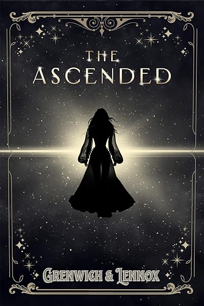
The Ascended (The Aesymarean Duet)

Hollow (Crown of Hearts and Chaos Book 1)

Eldritch (The Eating Woods)

The Bond That Burns: A Novel – A Spicy Romantasy and Dark Shifter Academy Story (Bloodwing Academy Book 2)
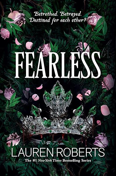
Fearless (The Powerless Trilogy)
Common Thumbnail Killers: A Visual Guide
Let's look at the specific cover choices that destroy thumbnail performance, based on the most frequent failures in our dataset.
Thin script fonts on busy backgrounds. A popular choice for romance and women's fiction — and the single most common thumbnail failure. The script's connecting strokes disappear at 200px, turning the title into an unreadable squiggle. The fix: use a bold script, add a contrast bar behind the text, or switch to a display serif that maintains readability at small sizes.
Titles in the center of a detailed image. The title competes directly with the background illustration for the viewer's attention. At full resolution, you can distinguish text from image. At 200px, they merge. The fix: position the title in a clear zone (top or bottom third) with low visual complexity behind it.
Too many text elements. Title, subtitle, series name, "A Novel by," author name, blurb quote — all on the front cover. At full resolution, each is readable. At 200px, they form a wall of tiny illegible text. The fix: title + author name only. Series name if absolutely necessary. Everything else goes in the description, not on the cover.
Decorative borders and frames. Ornamental borders that look elegant at full resolution become visual noise at thumbnail size. They eat into the available space without adding any conversion value. The fix: remove them. The border space is better used for a larger title or more breathing room.
Low-resolution source images. An image that looks fine at 800px but pixelates at 2560px produces a soft, blurry cover that reads as low-quality even at thumbnail size. The softness is perceptible at any resolution. The fix: always start with the highest available resolution for your background image.
Optimizing for Every Amazon Display Context
Your cover appears at different sizes in different places on Amazon. Here's how to ensure it works everywhere.
Search results (~200px wide): This is where most discovery happens. The title must be readable and the genre must register within 2 seconds. Optimize for this size first — everything else is secondary.
Category browse pages (~250-300px wide): Slightly more generous. Subtitles become partially readable here. The overall composition and color palette carry more weight because readers are specifically browsing your genre.
Product page (~500-800px wide): The reader has already clicked. At this size, the cover serves as a quality confirmation signal. Details, textures, and subtle typography effects become visible. This is where a professionally composed cover distinguishes itself from a basic design.
Also Bought / Customers Viewed (~150px wide): The smallest display context. Only the color palette, dominant shape, and title (if bold enough) register at this size. This is pure genre signaling — the reader's brain categorizes the cover as "looks like books I enjoy" or doesn't.
Kindle Library (~120-180px wide): After purchase, the cover becomes the book's icon on the reader's device. At this size, it needs to be recognizable — the reader needs to pick it out of a library of thumbnails. Distinctive color palettes and bold titles help here.
Your Thumbnail Optimization Checklist
Print this. Tape it to your monitor. Run through it before finalizing any cover.
Typography:
Title readable at 200px wide? Non-negotiable.
Font weight 400+ for serifs, 500+ for sans-serifs?
Title occupies 30-40% of cover width?
Author name present but not competing with title?
No more than 3 text elements on the cover?
Contrast:
Title contrast ratio 7:1+ against immediate background?
Passes the grayscale test (readable without color)?
No gold/light text on warm backgrounds without backing?
Dark text only on genuinely light areas?
Composition:
One dominant visual element (not three)?
Clear title zone with low visual complexity?
No decorative borders eating into usable space?
Color palette matches genre conventions?
Genre signal:
3-5 people correctly identify the genre from thumbnail alone?
Cover looks at home on your genre's Amazon bestseller page?
Font style matches genre expectations (serif/sans-serif/script)?
Color palette within genre norms?
If every checkbox is checked, your cover is optimized for thumbnail. If any item fails, fix it before publishing. The cost of a suboptimal thumbnail is measured in lost readers — the people who would have loved your book but never clicked because the cover didn't earn their attention.
Design a thumbnail-optimized cover with our AI Cover Generator
Once they click, your blurb closes the sale — write one that converts
Try These Ideas on Your Cover
Open the cover editor and preview fonts, colors, and layouts on your book cover.
Open Cover EditorRelated Articles
How AI book cover generators work, what they cost vs traditional designers, and when to use each option. Based on analysis of 2,500+ bestselling covers across 27 genres.
Cost, speed, quality, and uniqueness — a data-driven comparison of AI-generated book covers vs traditional designer covers. With real numbers and blind test results.
How color drives book purchase decisions — backed by bestseller data. Genre-specific color palettes, common mistakes, and the psychology behind why certain colors sell.