Series Cover Design: How to Build a Visual Brand
Learn how to design consistent series covers that boost readthrough. Data-backed guide covering fonts, color systems, layout templates, and branding elements across 2,500+ bestsellers.
Why Series Covers Are the Highest-ROI Investment in Self-Publishing
A single book is a product. A series is a business. And the visual thread that connects books in a series — the cover system — is what turns a casual reader into a loyal customer who buys every installment on release day.
In the publishing industry, readthrough is the metric that separates authors who earn a living from those who don't. Readthrough measures the percentage of readers who finish book one and buy book two, then book three, and so on. A series with 70% readthrough generates dramatically more revenue per reader than a series with 40% readthrough — and the difference compounds with every additional book.
We analyzed 2,500+ books across Amazon bestseller lists and found that series dominate the highest-earning genres. In romance, 54% of bestsellers are part of a series. In fantasy, it's 44%. In horror, 40%. These aren't coincidences — readers in these genres actively seek series because they want to spend more time in worlds they love.
But here's the critical insight: readthrough is heavily influenced by cover consistency. When a reader finishes book one and sees book two in their "also bought" recommendations, they need to instantly recognize it as the next installment. If book two has a completely different visual style — different fonts, different color treatment, different layout — the reader hesitates. That hesitation is where readthrough dies.
Professional series covers create an unmistakable visual brand. Pick up any bestselling romance or fantasy series and you'll see it: the same font pair, the same layout structure, the same design language. Only the dominant image and accent color change between books. The reader's brain processes "same series" in under a second — and the buy decision follows automatically.
This guide breaks down the exact system behind effective series cover design, based on patterns we observed across thousands of bestselling series covers.
The Anatomy of a Series Cover System
Every effective series cover system has two categories of elements: constants (what stays the same across every book) and variables (what changes). Getting this balance right is the entire challenge of series design.
Too many constants and every cover looks identical — readers can't distinguish between books and have trouble finding specific installments. Too many variables and the covers don't read as a series — readers don't recognize book three as the follow-up to book two.
The bestselling series we analyzed consistently follow a pattern we call the 70/30 rule: roughly 70% of the cover's visual elements remain constant across the series, while 30% change. Here's how that breaks down.
What Stays Constant
Font pair. The title font and author name font remain identical across every book in the series. This is non-negotiable. Typography is the strongest visual identifier humans process — we recognize font combinations faster than we recognize images. If book one uses Cinzel for the title and Cormorant Garamond for the author name, every subsequent book must use the exact same fonts at the exact same weights.
Layout structure. The position of the title, author name, and series tagline stays fixed. If your title sits in the top third with the author name at the bottom, every book follows that layout. If you use a horizontal rule or decorative divider between the title and subtitle, it appears in every book. The spatial arrangement is part of the brand signature.
Author name treatment. Size, position, color, and weight of the author name remain identical. Many successful series authors make the author name larger than the title — especially after the series gains traction — because the author name itself becomes the brand.
Series branding element. This is a visual marker that explicitly identifies the series. It might be a series logo, a banner with the series name, a numbered badge ("Book 2"), or a tagline position. Whatever form it takes, it appears in the same location with the same styling on every cover.
Design flourishes. Borders, corner ornaments, texture overlays, vignette effects, and any other decorative elements remain consistent. These subtle details contribute more to series recognition than most authors realize — they create a visual "frame" that the reader's brain categorizes as belonging to your series.
What Changes
Dominant background image. Each book gets a unique illustration or photograph that reflects its specific story. This is the most visible change between books and gives each cover its individual identity while the surrounding design system maintains series cohesion.
Accent color. Many successful series use a color-coding system where each book has a signature color. The overall palette stays in the same family (all dark and moody, all warm and bright, all cool and muted), but the dominant accent shifts — deep red for book one, midnight blue for book two, emerald for book three. This makes individual books instantly distinguishable even at small thumbnail size.
Subtitle or tagline. The text content of any book-specific tagline changes, but its position, font, and styling remain constant.
Book number. Obviously the "Book 1," "Book 2" indicator updates, but its visual treatment stays identical.
Series Covers in Practice: Genre Patterns
Dark Romance series — consistent typography, shifting moods
Cozy Mystery series — branded layout, changing scenes

No Stress Space Express: A Cozy, Low-Stakes, Slice-of-Life Scifi Adventure
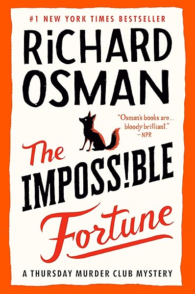
The Impossible Fortune: A Thursday Murder Club Mystery (Thursday Murder Club Mysteries Book 5)

Conspiracy in Paradise (Florida Keys Mystery Series Book 36)

Galactic Green Thumbs: A Cozy, Low-Stakes, Slice-of-Life Sci-fi Adventure (No Stress Space Express Book 9)
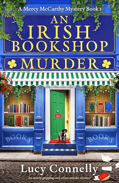
An Irish Bookshop Murder: An utterly gripping cozy crime murder mystery (A Mercy McCarthy Mystery Book 1)

Rescued in Paradise (Florida Keys Mystery Series Book 32)
Different genres handle series branding differently, and understanding your genre's conventions is critical. Here's what we see in the top-performing series across major genres.
Romance Series (54% Series Rate)
Romance has the highest series rate of any genre in our dataset — 54% of bestselling romance titles belong to a series. This makes series cover design essential for romance authors.
Romance series covers typically anchor on a consistent couple pose or figure composition, with each book varying the setting, clothing, and color temperature. The title font is almost always a display serif or script — and it never changes between books. Author names are usually prominent, often in a contrasting sans-serif or small-caps serif.
Dark romance sub-genre takes this further with moody, high-contrast treatments. The constants are bold: heavy serif fonts, dark backgrounds, dramatic lighting. The variable is typically a single model photograph with different poses or settings. With $7.58 average price and 58% KU enrollment, romance series readers consume voraciously — a consistent visual brand keeps them coming back.
Fantasy Series (44% Series Rate)
Fantasy readers are perhaps the most brand-loyal in all of publishing. With 19.4 million shelved books on Goodreads, fantasy is the largest reader community — and they love long series. At 44% series rate and $11.67 average price, fantasy series represent significant revenue potential.
Fantasy series covers use the most elaborate branding systems. Common patterns include ornate border frames that remain identical across books, metallic or embossed title treatments, and symbolic motifs (a sword, a crown, a sigil) that appear on every cover in the same position. The background illustration changes dramatically — different characters, different settings, different color palettes — but the "frame" is unmistakable.
Epic fantasy series often adopt a heraldic system where each book's cover features a different crest, symbol, or magical artifact, but the decorative frame and typography are identical. This mimics the visual language of classic fantasy publishers like Tor and Orbit, signaling to readers that this is a serious, ambitious series.
Mystery and Thriller Series (26% and 20%)
Mystery and thriller series have lower series rates — 26% for mystery, 20% for thriller — but the series that do exist are often extremely long-running (10+ books). These series need cover systems that can sustain visual coherence across many installments.
The pattern here is typically typography-dominant. The author name is enormous — often larger than the title — because in these genres, the author is the brand. The cover image is usually a simple, moody photograph (a dark street, a window, a shadowy figure) that provides atmosphere without dominating the design. The title changes position or color slightly between books, but the overall grid is locked.
Cozy mystery is the exception — it uses illustrated, colorful covers with a consistent illustration style (same artist, same character, same signature elements like a cat or a bakery) rather than the dark photographic style of traditional mystery and thriller.
The Template Approach: Building Your Cover System
Professional series cover design doesn't start with book one. It starts with a template — a master design file that defines every constant element, with clearly marked placeholder areas for the variables.
Think of it like building a house. You don't design a new foundation, framing system, and roof line for every room. You build the structural framework once, then customize the interiors. Your series cover template is the structural framework.
Here's the process we recommend, based on patterns from the most successful indie series:
Step 1: Define your genre's visual language. Study the top 20 series in your sub-genre. Identify the common constants: font styles, layout positions, color families, decorative elements. Your template should fit within these genre conventions while having its own distinctive personality.
Step 2: Choose your font pair. This is the single most important decision. Your title font and author name font will appear on every book you publish in this series — potentially for years. Choose fonts that are (a) highly readable at thumbnail size, (b) appropriate for your genre, (c) available in multiple weights for flexibility, and (d) licensed for commercial use on book covers.
Step 3: Lock your layout grid. Decide where every element goes. Title position (top, center, or bottom), author name position, series name position, book number position. Export a blank version of this grid — just colored rectangles where text and images will go — and verify that the spatial arrangement feels balanced at both full size and thumbnail size.
Step 4: Design book one. With your template defined, create the first cover. This is your proof of concept. Does the font pair work with the imagery? Does the color system hold up? Is everything readable at 200px wide?
Step 5: Test with a mock book two. Before publishing book one, create a rough mock-up of book two using the same template with a different image and accent color. If the two covers clearly read as a series when placed side by side — and if each is individually distinguishable — your template works.
Tip: Dear Pantser's Cover Editor lets you save template settings (fonts, positions, effects) and apply them across multiple covers. Design your system once, then generate variations for every book in your series — consistent branding without starting from scratch each time.
Template-driven series — one system, many books

Enchantra: A spicy fantasy romance (Wicked Games Book 2)
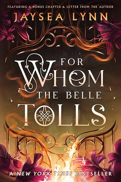
For Whom the Belle Tolls

Powerless (The Powerless Trilogy)

Trial of the Sun Queen (Artefacts of Ouranos Book 1)

Divine Rivals: A Novel (Letters of Enchantment Book 1)
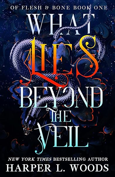
What Lies Beyond the Veil (Of Flesh & Bone Book 1)

Riftborne (Esprithean Trilogy Book 1)

The King has Fallen: A Fallen Angel Romantasy (The Kingdom of the Krow Book 1)
Mistake: Visual Clutter Destroys Series Recognition
The most common series cover mistake isn't inconsistency between books — it's overcrowding within each book. When individual covers are cluttered with too many visual elements, the constants that tie the series together get buried.
Consider a fantasy series where each cover has a different illustrated character, a different background scene, a different foreground object, a different border style, a different color treatment, AND the series title, book title, author name, tagline, and book number. Even if the font pair is consistent, the reader's eye can't find it amidst the visual noise.
Series covers need even more restraint than standalone covers. The constants (fonts, layout, decorative elements) need breathing room to be visible and recognizable. The variable (background image, accent color) needs to be dramatic enough to distinguish books from each other. Everything else is noise.
The formula that works: one dominant image + consistent typography + one accent color shift = recognizable series cover. Strip away anything that doesn't serve one of those three purposes.
At thumbnail size — where most buying decisions happen — a clean, well-structured series cover with clear typography will always outperform a cluttered cover with more "interesting" elements. The goal isn't to win a design award. The goal is to make a reader think "oh, book three is out!" in under a second.
Color Systems: The Silent Branding Tool
Color is processed by the human brain faster than text or imagery. A well-designed color system is the single most effective tool for creating instant series recognition — and for making individual books distinguishable within that series.
There are three color system approaches that dominate bestselling series:
Fantasy — metallic and jewel-tone color systems

On Wings of Blood: A Novel (Bloodwing Academy Book 1)

Rain of Shadows and Endings (The Legacy)

A Tongue so Sweet and Deadly (The Compelling Fates Saga)

Shield of Sparrows: An Enemies-to-Lovers Epic Romantasy

We Who Will Die: An Epic Romantasy of Forbidden Love, Deadly Secrets, and Vampires in a High-Stakes Arena, Discover a Vividly Reimagined Ancient Rome (Empire of Blood Book 1)
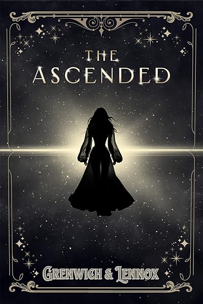
The Ascended (The Aesymarean Duet)
Horror — dark palette with accent shifts

The First Witch of Boston: A Novel
On Wings of Blood: A Novel (Bloodwing Academy Book 1)
We Who Will Die: An Epic Romantasy of Forbidden Love, Deadly Secrets, and Vampires in a High-Stakes Arena, Discover a Vividly Reimagined Ancient Rome (Empire of Blood Book 1)
The Ascended (The Aesymarean Duet)

Eldritch (The Eating Woods)
Enchantra: A spicy fantasy romance (Wicked Games Book 2)
The Monochromatic Shift
Every book stays within the same color family, but the dominant hue shifts. A dark romance series might go from deep crimson (book one) to burgundy (book two) to blood orange (book three) to dark rose (book four). The reader's brain registers "dark, warm tones" as the series signature, while individual books are easy to tell apart.
This approach works best for romance, dark fantasy, and horror — genres where mood is paramount and the color palette is inherently constrained (warm/dark tones dominate).
The Complementary Palette
Each book gets a distinct color from a pre-selected palette. A fantasy series might use gold, silver, bronze, and copper — all metallic tones that feel cohesive but are clearly different. A mystery series might use navy, forest green, deep purple, and charcoal — all dark but distinguishable.
This works well for fantasy, sci-fi, and mystery series that run to many volumes, because you have more distinct colors to work with before the system starts repeating.
The Signature + Variable
The series has one signature color (always present in the same element — a border, a title effect, a banner) while the background color changes freely. A thriller series might always have a red title, regardless of whether the background is dark blue, grey, black, or green.
This is the most flexible system and works across all genres. It's particularly effective for long-running series (8+ books) because the signature element provides recognition even when the background imagery varies widely.
Series Branding Elements That Work
Beyond fonts and colors, successful series use specific branding elements that create additional touchpoints for recognition. Here are the most effective ones we observed across bestselling series.
Series name banner. A horizontal strip (often at the top of the cover) with the series name in a distinct font or style. This is the most common and most effective series identifier — it's readable at thumbnail size and unambiguously communicates "this book belongs to X series."
Numbered badge. A visual marker (circle, shield, diamond) containing the book number. When placed in a consistent corner, readers can quickly identify which installment they're looking at. This matters more than you'd think — readers frequently re-buy books they already own because they can't tell books apart in a series.
Recurring motif. A small symbolic element that appears on every cover — a dagger, a crown, an animal, a flower. This works particularly well in fantasy and romance, where symbolic imagery carries emotional weight. The motif should be small enough not to interfere with the main design but distinctive enough to notice.
Author logo. Some prolific series authors develop a personal logo or monogram that appears on all their covers. This is an advanced branding move that works best when you have multiple series — the author logo connects books across different series.
Tagline position. A consistent tagline location (e.g., always below the title, always in italic, always the same font size) where each book's unique tagline appears. Even if readers don't consciously read the tagline at thumbnail size, its presence and position contribute to the overall pattern recognition.
Pro tip: Pick no more than two branding elements beyond your font pair and color system. A series name banner + numbered badge is enough. Adding a logo + motif + tagline + ornamental border creates the very clutter that undermines series recognition. Less is more — the branding system should fade into the background and let readers focus on what's new about each book.
The Readthrough Math: Why Consistency Pays
Let's make the business case for series cover consistency with real numbers from our dataset.
Assume you've written a five-book romance series. Each book is priced at the genre average of $7.58 (our data across 2,500+ books). You launch book one and acquire 1,000 readers.
Scenario A: Inconsistent covers (40% readthrough).
Book 1: 1,000 readers × $7.58 = $7,580
Book 2: 400 readers × $7.58 = $3,032
Book 3: 160 readers × $7.58 = $1,213
Book 4: 64 readers × $7.58 = $485
Book 5: 26 readers × $7.58 = $197
Total: $12,507
Scenario B: Consistent, branded covers (70% readthrough).
Book 1: 1,000 readers × $7.58 = $7,580
Book 2: 700 readers × $7.58 = $5,306
Book 3: 490 readers × $7.58 = $3,714
Book 4: 343 readers × $7.58 = $2,600
Book 5: 240 readers × $7.58 = $1,819
Total: $21,019
The difference: $8,512 in additional revenue from the same 1,000 initial readers, just by maintaining visual consistency that makes each subsequent book instantly recognizable as the next installment.
And this understates the impact. Consistent series covers also benefit from algorithmic reinforcement. Amazon's recommendation engine promotes books that readers buy in sequence. Higher readthrough means more sequential purchases, which means stronger "also bought" connections, which means more organic discovery — a virtuous cycle that inconsistent covers never trigger.
For Kindle Unlimited authors — where 58% of romance and 42% of fantasy bestsellers are enrolled — the math is even more dramatic. KU pays per page read, so readthrough directly translates to page-read revenue across the entire series. A reader who stops at book one generates 300 pages of revenue. A reader who reads all five books generates 1,500 pages. Same acquisition cost, 5x the revenue.
Bottom line: Series cover consistency isn't a nice-to-have aesthetic preference. It's a revenue multiplier. Every percentage point of readthrough you gain by making your covers visually cohesive translates directly to money. This is one of the few areas where the creative decision and the business decision are perfectly aligned.
Common Series Cover Mistakes to Avoid
Based on our analysis, these are the series-specific mistakes that most frequently hurt readthrough and brand recognition.
Rebranding mid-series. Changing your cover style partway through a series is the most damaging mistake you can make. Readers who loved your first three books won't recognize book four with a completely different design. If you must rebrand, rebrand the entire series at once — all books get new covers in the new system simultaneously.
Different designers for different books. Unless the new designer is working from an explicit style guide with exact font names, sizes, colors, and positions, each designer will bring their own interpretation. "Make it look similar" is not a brief — provide exact specifications or use the same designer throughout.
Inconsistent spine design. For print books, spine consistency is just as important as front cover consistency. Readers who own your physical books see the spines on their shelf. If the spine design (font, color, layout) changes between books, the shelf display looks random rather than curated.
Genre drift. If your series evolves from one sub-genre to another (e.g., starts as cozy mystery, develops romantic elements by book four), your covers need to evolve subtly within the same design system. Don't suddenly switch to romance cover conventions just because the romance subplot grew. Instead, adjust your accent colors and imagery to hint at the tonal shift while maintaining your established template.
Forgetting the box set. If you plan to eventually release a box set or omnibus edition, design your series template with this in mind from the start. The box set cover needs to incorporate elements from the individual covers (or all of them simultaneously) while still functioning as a standalone cover. Series that use a consistent color-coding system make this easy — the box set can feature all the series colors together.
Action step: If you already have a series with inconsistent covers, the ROI of rebranding is almost always positive. Calculate your current readthrough (book 2 sales ÷ book 1 sales), rebrand with consistent covers, and measure the readthrough change over 90 days. Most authors who rebrand see a 10-20% readthrough improvement within the first quarter.
Build Your Series Cover System Today
Series cover design isn't about artistic talent — it's about systematic thinking. Define your constants, define your variables, lock your template, and execute consistently across every book.
The authors earning the most in our dataset aren't necessarily the best designers. They're the ones who understood that a series is a visual brand, treated their covers as branding assets rather than one-off art projects, and maintained discipline across every release.
Here's your checklist:
1. Study the top 20 series covers in your sub-genre
2. Choose a font pair and test it at thumbnail size
3. Define your layout grid (element positions)
4. Choose your color system (monochromatic, complementary, or signature)
5. Select 1-2 branding elements (series banner, numbered badge)
6. Design book one using the template
7. Mock up book two to verify the system works
8. Document everything for future books
Dear Pantser's Cover Editor is built specifically for this workflow. Create your series template with genre-curated fonts, save your settings, and generate consistent covers for every book in your series. No design experience required — the template system handles the consistency, and you focus on choosing the imagery that makes each book unique.
See how bestselling series maintain visual consistency

Beautiful Venom: A Dark Hockey Romance (Vipers Book 1)

Kiss The Villain: A Dark MM Enemies to Lovers Romance
Rain of Shadows and Endings (The Legacy)

Storm of Secrets and Sorrow (The Legacy Book 2)
A Tongue so Sweet and Deadly (The Compelling Fates Saga)
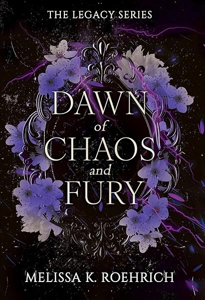
Dawn of Chaos and Fury (The Legacy Book 4)
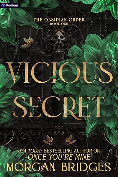
Vicious Secret: A Dark Romance (The Obsidian Order Book 1)
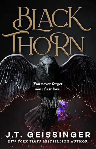
Blackthorn: A Dark Gothic Romance

Wicked Altar: A Dark Irish Mafia Arranged Marriage Romance (The McCarthy Family Legacy)

HIDE AND SEEK: A Dark Stalker Romance (Hide and Seek Series Book 1)
Try These Ideas on Your Cover
Open the cover editor and preview fonts, colors, and layouts on your book cover.
Open Cover EditorRelated Articles
How AI book cover generators work, what they cost vs traditional designers, and when to use each option. Based on analysis of 2,500+ bestselling covers across 27 genres.
Cost, speed, quality, and uniqueness — a data-driven comparison of AI-generated book covers vs traditional designer covers. With real numbers and blind test results.
How color drives book purchase decisions — backed by bestseller data. Genre-specific color palettes, common mistakes, and the psychology behind why certain colors sell.